

CSS Grid has been magic for our UXD (UX Developer) team of consultants at DockYard. Luckily we have a couple of projects where CSS Grid passes browser requirements. Defining a complex responsive layout with one or two CSS declarations is beyond useful. One thing that kept coming up was how nice it would be to have a traditional 12-column grid that can be applied across the app suite we are working on. From this need I started thinking, "How can we describe a 12 column grid while still using our CSS naming methodologies and not cause code bloat with classes everywhere?”
With convincing from some UXD team members, I started looking into data attributes and the specs definition. It turns out that data attribute usability has increased as of late; in theory, the data attribute values 1-12, that I will show later in this post, could be thought of as data. Then CSS can use that data to make decisions.
What this 12-column grid provides is a consistent pattern that any developer working on the same project can utilize, bringing harmony to the look and feel of the application. Not only that, repeatability of the HTML/CSS is a small performance win: The CSS for the grid layout is reusable across all HTML assets along with the class names in the HTML being repeated. When this code is compressed, it will result in smaller downloadable assets for users.
Currently we can do this work in about 200 lines of CSS, but in the future we could condense this to around 20 lines if data attributes get the ability to pass integers in CSS.
Grid Overview
Our 12-column grid uses CSS Grid properties that are dependent on custom data attributes to define a mobile-first grid layout. The data attributes will define how many columns an element will span on the grid. If only a small data attribute is defined, that value will be true for medium and large viewports. The same goes for medium and large data attributes: only having a medium attribute value will enforce that value for medium and large viewports.
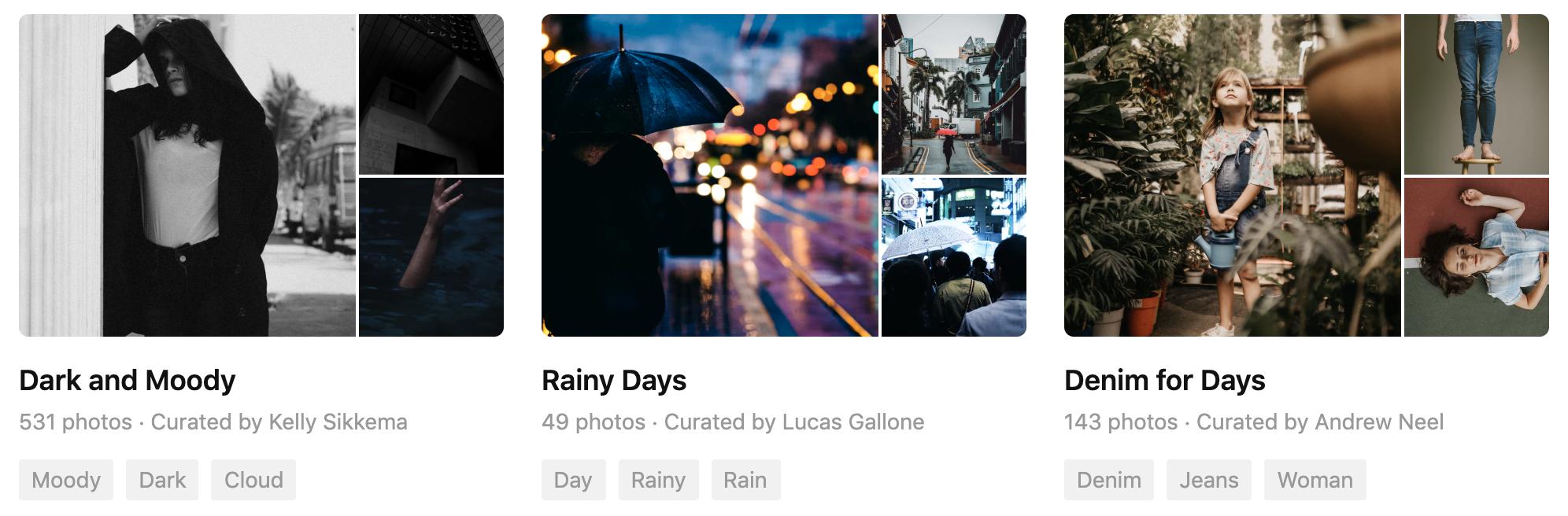
Examples of grid systems being used in the wild can be easy to find, a quick example is https://unsplash.com. If you inspect these two examples with dev tools, you will find the use of a 12-column grid system:
 6 column item + 6 column item layout example
 4 column item + 4 column item + 4 column item layout example
Required Classes for narwin-grid
narwin-gridis the block-level class name that acts as the container for the items. For example,<form class="narwin-grid”>will apply the grid system to the form.narwin-grid__itemis the element-level class name that belongs on the element that will be sized by the grid. For example,<fieldset class="narwin-grid__item”>without any data attributes will default to a span of 12 columns.
Optional Data Attributes for narwin-grid Items
The data attributes below are directly associated with class="narwin-grid__item”. The data attributes must be defined on the grid item, as seen in the code snippet below.
data-grid-small="”takes values 1 through 12. This represents how many columns an element can span across within the grid layout. For example,data-grid-small="6”defines that the item will span 6 columns for small viewports and above.data-grid-medium="”takes values 1 through 12. For example,data-grid-medium="4”defines that the item will span 4 columns for medium viewports and above.data-grid-large="”takes values 1 through 12. For example,data-grid-large="8”defines that the item will span 8 columns for large viewports.data-grid-item-start="”takes values 1 through 12. For example,data-grid-item-start="2”states that the item will start on the second column in the grid, giving the item an offset of 1.data-grid-item-start="1”will move an item to a new row if it is not the first item on an existing row.- Note: please use caution when using
data-grid-item-start="”to ensure that the grid layout does not create implicit columns beyond the desired 12 column layout. For example, usingdata-grid-item-start="8”in conjunction withdata-grid-large="8”will cause 3 implicit columns to be generated (the item occupies columns 7–12, plus 3 implicit columns to accommodate a span of 8 columns, starting at column 7). This will disrupt the grid layout and cause misalignment per CSS Grid spec.
- Note: please use caution when using
The Code
The grid system is available on CodePen (narwin-grid) as a boilerplate. This boilerplate will allow you to use the grid relative to your project by giving you the flexibility to set up breakpoints, gutters, and naming.
Note: the following code examples use CSS nesting. At DockYard, we use PostCSS to handle the CSS processing of nesting, as well as several other PostCSS plugins via narwin-pack - npm.
I will only cover the key points in these code examples but all the code can be seen at narwin-grid on CodePen. There is a narwin-grid example also on CodePen.
CSS:
/* 12 column grid system */
.narwin-grid {
 display: grid;
 grid-template-columns: repeat(12, 1fr);

 @media (max-width: 575px) {
 grid-column-gap: 12px;
 }

 @media (min-width: 576px) {
 grid-column-gap: 24px;
 }
}

.narwin-grid__item {
 /* Default layout when [data-grid-small] is not declared */
 &:not([data-grid-small]) {
 grid-column-end: span 12;
 }

 /* Data attributes that control the amount of columns an item will span within the 12 column layout for all viewports */
 &[data-grid-small="1"] {
 grid-column-end: span 1;
 }
 &[data-grid-small="2"] {
 grid-column-end: span 2;
 }
 &[data-grid-small="3"] {
 grid-column-end: span 3;
 }
 ...
 ...

 /* Data attributes that control the amount of columns an item will span within the 12 column layout for "medium" viewports and up */
 @media (min-width: 576px) {
 &[data-grid-medium="1"] {
 grid-column-end: span 1;
 }
 &[data-grid-medium="2"] {
 grid-column-end: span 2;
 }
 &[data-grid-medium="3"] {
 grid-column-end: span 3;
 }
 ...
 ...
 }

 /* Data attributes that control the amount of columns an item will span within the 12 column layout for "large" viewports and up */
 @media (min-width: 1024px) {
 &[data-grid-large="1"] {
 grid-column-end: span 1;
 }
 &[data-grid-large="2"] {
 grid-column-end: span 2;
 }
 ...
 ...
 }

 /* Grid item start values that position elements on the 12 column grid, this is just like setting an offset for grid items */
 &[data-grid-item-start="1"] {
 grid-column-start: 1;
 }
 &[data-grid-item-start="2"] {
 grid-column-start: 2;
 }
 &[data-grid-item-start="3"] {
 grid-column-start: 3;
 }
 ...
 ...
}
HTML Example:
<form class="narwin-grid">
 <fieldset class="narwin-grid__item" data-grid-small="4" data-grid-medium="4" data-grid-large="6" data-grid-item-start="2">
 ...
 </fieldset>

 <fieldset class="narwin-grid__item" data-grid-small="1" data-grid-medium="7" data-grid-large="5">
 ...
 </fieldset>

 <fieldset class="narwin-grid__item" data-grid-small="3" data-grid-medium="4" data-grid-large="7" data-grid-item-start="1">
 ...
 </fieldset>
</form>
 Visual example of the HTML example above on a medium 930px viewport
With these easy-to-understand data attributes and class names, your team can set up and use a 12 column grid system whether developing a website or web application. No negative margins or complicated calculations, with the added benefit of knowing that it’s built with future HTML/CSS specs in mind.
DockYard is a digital product agency offering exceptional strategy, design, full stack engineering, web app development, custom software, Ember, Elixir, and Phoenix services, consulting, and training. With a nationwide staff, we've got consultants in key markets across the United States, including San Francisco, San Diego, Phoenix, Detroit, Pittsburgh, Baltimore, and New York.
