

You'll see cross-disciplinary teams all over the world, working on every kind of project. After all, a house is typically built by people with many different specialties.
And no matter whether you're building a house or a digital product, having a common application to collaborate has significant benefits.
At DockYard, we create teams that include all the fields needed to build an application, from project management and product design to user experience development (UXD), engineering, and quality assurance (QA).
Together these fields cover the entire process of application management, creation, and delivery.
One of the tools we use at DockYard to help our teams collaborate is Storybook, an open-source JavaScript tool for building and showcasing UI components and pages in isolation.
We use it in the building process and to improve collaboration between the different fields in cross-disciplinary teams.
Component Driven Development
Remember the example of a team of people with different specialties building a house?
There’s a common comparison made between building an application and building a house on a technical aspect. A house is made of different parts that each has its own size, shape, purpose, and configuration.
By combining them you create bigger parts. Combining those bigger parts gives you a house.
It’s the same for applications.
Take a form, for example. It’s built out of different input fields and buttons.
Combining those input fields, buttons, text, forms, and sections all together into different pages can then be combined into a fully functional application. These small parts are considered components.
All major JavaScript UI frameworks —like Ember, React, Svelte, and Vue— are component-driven.
This means that UIs are built starting with atomic components. Building up from the individual components and combining them into bigger sections that eventually work together gives you all the parts to build full pages.
Building applications out of smaller parts also makes it easier to reuse blocks and focus on specific blocks to make them appear and behave the way you want them to.
Then you can test parts individually either manually or with automated tests.
A project built out of components is all you need to use Storybook.
What is Storybook
Storybook is a powerful frontend tool that allows teams to build, design, test, document, and showcase/organize UI components and/or screens outside the application context.
Teams that work with JavaScript frameworks or even plain HTML can use it. (Quoting Storybook: "If it's a UI, you can build it with Storybook.”)
On their feature support page you can see what frameworks are supported and which features will be available for those frameworks.
With Storybook we can test and showcase components in isolation. The nice thing about Storybook is that once it’s set up by the engineers, anyone can use it.
That way the whole team can be involved in building (or at least verifying) the app's building blocks and managing the quality of the final product.
You might be thinking, what does building, showcasing, documenting, and organizing mean when it comes to Storybook?
There’s no better way to explain what Storybook can do for you than just showing you.
How to Use Storybook
Setting up Storybook is a story on its own that can be interesting for engineers. Today I want to focus on the value for everyone on the team, so we’ll take a look at an already implemented Storybook project.
To make it easy I’m using Storybook’s Design System implementation, which is a reusable component library and a great use case for a Storybook demo.
Structure

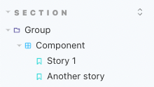
On the left, you see the navigation that helps you find the right components. It's a file tree with all your components and stories. A component can have multiple stories: all the different versions or states of the component. It can be structured using sections (optional), then optionally grouped by anything you want (like component types or parent), and then you’ll have the components.
On the top, you'll see a few documentation files to easily and structurally document whatever you like. That might be details on how to use the app/project; design rules or themes; or anything that’s not components or page specific.
On the right side, you see the main screen that will show the canvas by default. It has everything you want to see for a selected component’s state (story).
This is where everyone will verify the look and feel of the component as it will end up in the application.
It shows you how it looks in the state set up and you can interact with it as you would in the actual application (visual interactions, no real actions).
The canvas view is divided into two sections: one that shows the rendered component and the addon panel.
Both the toolbar on the canvas and the addon panel add major value to using Storybook for all team members by adding the functionality to showcase the component.
Addons
Storybook itself provides the basics to showcase your components. One of its key strengths is its extensibility. Using addons makes it possible to extend, configure, and customize Storybook's UI and behavior to fit your team's needs.
With addons you can extend the API or (more commonly) the UI.
For example, you can modify the canvas toolbar or add data and interactions in the addon panel.
Storybook ships by default with a set of essential addons. I won't be able to go over all the features that are possible with the addons, but let me highlight a few basic features from the essential addons.
DocsPage helps you to generate documentation for every component out of the box.
It combines your different stories, descriptions, docgen comments, and code examples into a single page.
For most frameworks, it can extract a component's description and arguments just from setting the imported component.
The Controls addon adds the most value for changing a story's settings.
It gives you a nice UI that lets you change the component arguments or story settings without needing to make any code changes.
You can edit them live and see how it changes the look or behavior of the component so you can easily play around with different states.
This adds value to all the team members because everyone can create their own state for the component that suits their needs and see the expected version.
Same as for the docs, it can auto-generate controls based on your component. It supports different control types like text, number, range (slider), radio buttons and checkboxes, a (multi) dropdown list, or a color or date picker.
Some of the toolbar addons will add the most value to UXD engineers and designers.
They usually want to make sure that every pixel is correct and matches design specs.
The essentials come with a viewport addon that allows you to change the preview size to fake a different size like mobile or tablet views.
There's an easy one to toggle the background color of the canvas. And to verify all dimensions of a component there's a Measure & outline addon.
It gives you the tooling to inspect and visually debug CSS layout by highlighting component measurements (sizing, padding size, margin size).
Beside these essential addons there's a large catalog of official and third-party addons available. They can help with different needs, from testing, data, and styling to design, appearance, and organization.
Almost all addons are customizable so they can be set up with the options that you need for your team.
Find the full list of addons on the Storybook Addons website.
Value of using Storybook
As Storybook helps visualize components, it adds major value to cross-disciplinary teams broadly, and particularly for team members who are not involved in writing code.
Because components and/or pages can be tested and viewed in isolation, it is easy to build, test, and verify a component without running the application. Every team member can view and play around with it without the need for a development environment or any coding knowledge.
With Storybook, you can add different states of a component to cover them all, even those hard-to-reach use cases. No need to worry about different API states and to find all different use cases in a running app.
It brings the members of cross-disciplinary teams closer together and gives everyone the ability to be involved in the full development process.
- Design defines how the component should look,
- the engineer builds the component and sets up stories,
- UXD adds styling,
- design / QA can verify,
- the product manager and stakeholders can easily see how parts of the application look, feel, and work;
...all in isolation and without running the actual application.
Conclusion
For cross-disciplinary teams working with a JavaScript and HTML UI, Storybook adds a lot of value by simplifying and speeding up processes.
It improves the involvement of management, stakeholders, and design during the development phase.
And aside from the visualization aspect, it also easily functions as a component or style guide for anyone on the team, including stakeholders and designers.
And now…
Want to start using Storybook yourself? Or read more about it? Go take a look at their website https://storybook.js.org/.
Storybook's website has a showcase where you can see the implementation from other teams.
The Storybook Components that I mentioned earlier can be found here, as can other Storybooks from leading UI engineering teams.
All these Storybook examples are published with Chromatic, a free service to publish your Storybook UI components that adds features for a smooth reviewing process.
