Flywheel
Helping instructors inspire riders through experience and service design.
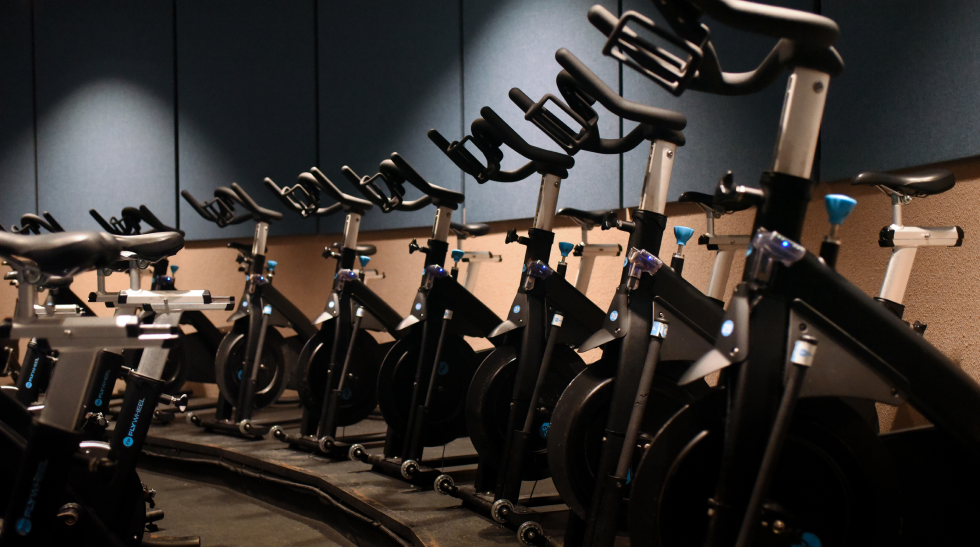
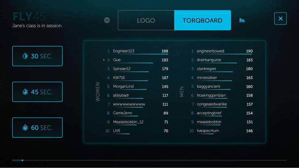
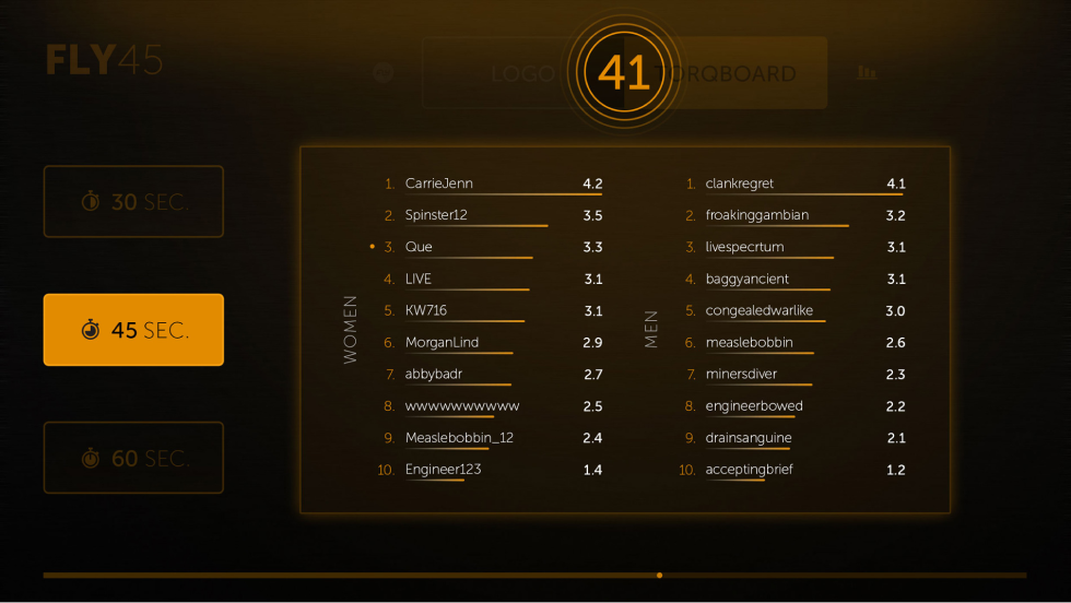
Flywheel is a US-based indoor cycling company with more than thirty locations in twelve states and internationally. They offer challenging, data-driven workouts. The uniquely competitive in-class experience is built with real-time feedback on individual performance, leaderboards for class benchmarking, and intense, upbeat instruction. DockYard dramatically reduced system and user-caused errors, improved class instruction, and developed a scalable system that opens new doors for Flywheel’s service design.
The challenge
Each bike in Flywheel’s indoor cycling spaces comes equipped with an individual screen that displays the rider’s performance. The interfaces for instructors and riders during class were confusing and error-prone. For example, a drop of sweat on the instructor touchscreen could land on the “end class” control and cause riders’ data to be lost. There were communication issues between the bike computers, the instructor’s control panel, and the backup system. For the company to continue its impressive growth, the user-facing technology and underlying architecture both needed to be rebuilt.
The solution
01 Giving instructors the tools they need
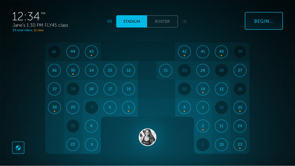
We improved the touchscreen instructor control panel to help instructors provide top quality service to riders. After interviewing several instructors, we addressed top pain points and redesigned the control panel from scratch. A map that matches the in-studio layout now allows the instructors to quickly find a specific rider and to spot first-time riders who might need additional attention. Ergonomic control placement and an improved user interface before starting or stopping a class prevents critical errors and data loss.

02 A better ride
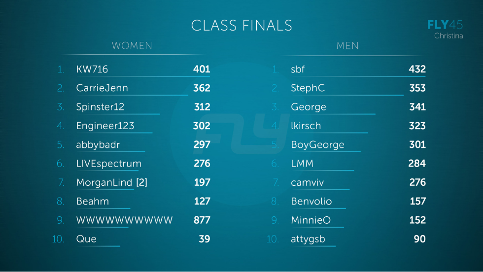
We took a holistic look at the rider’s experience and identified simple but effective changes to make it even more immersive. We reduced anxiety for new riders by providing context. They now see the time remaining until class starts, their name on the bike, and an indication of “race mode” and other class events.
03 Improved software architecture
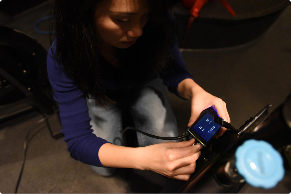
The Flywheel application architecture was completely rebuilt using web technologies like Ember.js. DockYard took web technologies designed to run in a web browser and engineered solutions to allow them to run on a desktop client. Exchanging real-time statistics and class metadata using WebSockets enabled a more streamlined and robust communication model than the previous USB-based infrastructure allowed. DockYard leveraged the richness of browser-rendered interfaces and the performance of Ember to design a beautiful, interactive, and fluid user experience.
04 Systems thinking
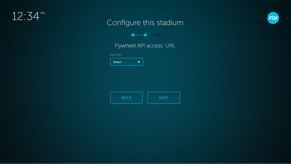
Flywheel is growing fast, adding new studios on a regular basis. We helped Flywheel consider the experience of setting up a new studio. After interviews to gather top pain points, we created a streamlined set-up workflow. It saves time and frustration by automating portions of the set-up, presenting questions in a logical sequence, and offering helpful hints. The new setup sequence makes it very easy to configure a new stadium, or even to set up a virtual stadium for special events.
We hired DockYard to develop a next generation TorqBoard experience for Flywheel customers. The goal was to create dramatic customer engagement, substantially improved scalability, and create highly efficient and streamlined tools/UI for fitness studio staff. The DockYard team delivered on all fronts. The most convincing proof is how enthusiastic and passionate the response has been in the rider community.
05 A scalable system
Flywheel serves thousands of riders daily, in dozens of studio locations. We made improvements to their application’s design and architecture, while putting usability and scalability at the forefront of the final product. We created a new foundation for intra-studio digital operations and made fundamental improvement to service design. We’re pleased to have delivered a product that will allow Flywheel to accomplish their ambitious business goals of growth and fitness tech innovation for years to come.
