
Right now, you can’t transition a gradient in CSS. This is because the various gradient syntaxes (linear-gradient, radial-gradient, repeating-linear-gradient, and conic-gradient) are all values of the background-image property. CSS doesn’t currently allow transitions or animations on background-image, thus gradient can’t be transitioned. Behold:
See the pen Transitioning Gradient: Background Transition on CodePen.
This is a pretty frustrating limitation. Gradients are made of 3 parts: direction (linear) or position (radial), color values, and color stops. All those values are numbers: a browser should be mathematically capable of transitioning them. Some browsers recently started transitioning between background images in url() so it’s unfortunate that browsers won’t transition gradients now.
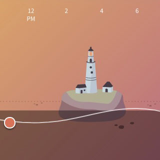
As we built a recent progressive web app, we had to work around this limitation. As a user scrolls through a timeline of tide data, a gradient representing the time of day transitions through gradients with colors representing night, dawn, day, dusk, and a few in-between phases. In order to give our app that native feel of smooth transitions, we had to get clever.
Previous Tricks
Some people have figured out some sneaky tricks for pretending to animate a gradient in the background. Let’s look at a few of them quickly:
Move the Background
If your gradient needs to move, you can draw it larger than the element that uses it and transition the background-position property. (Yes, I know this is not a performant transition: I’m not recommending it, just acknowledging that it’s a working hack.)
See the pen Transitioning Gradient: Background Position on CodePen.
Move a Pseudo-Element
This is a modification of the trick above, but instead of transitioning background-position, it uses the ::before pseudo-element, makes it twice as tall as the containing element, and then transitions transform for a very performant animation. You get the same visual effect, but it’s much nicer on your device’s processor.
See the pen Transitioning Gradient: Pseudo-Element on CodePen.
Use an Overlay
This fits a separate use case. In this method, we don’t get the visual effect of a "moving" background. Rather, one color changes. In this instance, we create a gradient that fades to transparent in background-image, then transition the background-color behind it. Only one of the colors changes, but if the entire background-gradient is semi-transparent, the entire gradient appears to change color. If you use mix-blend-mode or background-blend-mode (and blending is actually supported in your users’ browsers), you can create some really interesting effects with color blending.
See the pen Transitioning Gradient: Pseudo-Element Overlay on CodePen.
A New(er) Trick
None of these techniques matched our use case, however. We needed to transition both colors in the gradient without any visible motion. We found a good solution using an SVG mask.
We start by putting an actual SVG into the markup as the immediate child of the element that we want the gradient to cover. Let’s look at that SVG and talk through the code it contains:
<svg class="bg-mask" viewBox="0 0 1 1" preserveAspectRatio="xMidYMid slice">
 <defs>
 <mask id="mask" fill="url(#gradient)">
 <rect x="0" y="0" width="1" height="1"/>
 </mask>
 <linearGradient id="gradient" x1="0" y1="0" x2="0" y2="100%" spreadMethod="pad">
 <stop offset="0%" stop-color="#fff" stop-opacity="1"/>
 <stop offset="100%" stop-color="#fff" stop-opacity="0" />
 </linearGradient>
 </defs>
 <rect class="fg" x="0" y="0" width="1" height="1" mask="url(#mask)"/>
</svg>
In the SVG, we’re using viewBox="0 0 1 1" so that all the internal coordinates are based off of a 1px relative grid. With CSS, we can stretch the SVG to cover its parent; this viewBox just simplifies our math.
When the SVG stretches differently from its 1:1 aspect ratio, we want to keep it scaled nicely. That’s what we gain from preserveAspectRatio="xMidYMid slice". The SVG’s internal elements will expand to cover the SVG’s rendered size. If you’re familiar with CSS, this is the equivalent of telling the SVG’s contents to behave like background-size: cover and background-position: center. If you’re going with a horizontal or angled gradient, you may need to adjust that value to get the desired visual effect.
The defs element in an SVG contains elements that can be used to mask or fill other elements but aren’t visually rendered on their own. Our first element there is mask that contains a rect - the mask will be used on a visible element outside of defs; the rect ensures that the mask takes up space.
Then we find a linearGradient element: we’ll draw a white gradient from opaque to transparent with two stop elements. For the mask to work as desired, their stop-color needs to be white, but you can modify them or add more as desired to create more complex stripe patterns.
The mask is told to use this linearGradient to create its masking pattern.
Outside of defs we have a lone rect - this is the only SVG element visible to users. This element uses mask="url(#mask)" to create a gradient mask while still allowing us to transition its fill color with CSS.
This brings us to CSS. Here we can transition or animate the background-color on the element itself, and the fill color on the visible rectangle. Ta-da! Both colors in the gradient transitioning together!
See the pen Transitioning Gradient: SVG Mask on CodePen.
Gotchas
Of course, no CSS trick ever works perfectly. We ran into a few snags and trade-offs implementing this technique.
Performance
It is true, color (background, border, or fill) isn’t the most performant property to transition, but it’s not the worst either. We’re including will-change to get some GPU acceleration help and improve the transition. Also, we’re not going to transition 318 layers simultaneously! In our app, we’re only changing a single instance of this gradient (2 layers). If you use this technique with 1 dozen masked rectangles, your mileage will certainly vary - good luck.
Banding
Depending on the mask you draw, you may see visible banding on the gradient. We found this when the gradient was rotated 45°. This is a more complicated issue to solve, but here are the things that helped us improve the visual rendering of the gradient.
We used some CSS on the SVG to smooth it out: filter: blur(3px). Different values will give you more or less improvement on the banding issue, but they introduce a performance hit. We started with the blur value at 10px but transitioning the color inside the blurred SVG ended up being really costly and dropped the transition performance well below 60FPS. We dropped the blur down to 3px - now the banding was a bit more noticeable (especially on non-retina screens) but the transition performance was good again.
Using a CSS filter also introduced a new constraint: the blur filter starts from the edge of the container, so the outer 3px of the SVG are "blurred in" and the gradient doesn’t extend edge-to-edge properly. Our solution to this was to change the absolute position values on the SVG: -3px all around. This required overflow: hidden on the containing element. In this situation that was the page background, so the overflow restriction didn’t harm anything, but that’s not true in every situation.
Conclusion
We can’t currently transition a CSS gradient, but by using an SVG mask, we can create a gradient and transition all its colors. I’d love to see browser vendors enable transitions on gradients at some point in the future. That transition would likely function similar to clip-path: polygon() and SVG path values: browsers require those values to have the same number of points in order to transition them. That would be a reasonable limitation on transitioned gradients. Until then, however, an SVG mask provides the most performant way to transition multiple colors in a gradient.
