
This is Part 2 of 2 in a series that explores how we can apply new CSS techniques on a more granular component level. If you haven’t already, be sure to check out Part 1, which covers component-level CSS Grid.
Now that we’ve leveled up with all that Grid Goodness, let’s take a look at something we’re calling Responsive CSS Variables.
What are Responsive CSS Variables?
"Responsive CSS Variables” is a phrase we’ve begun to use here at DockYard to describe a new approach to responsive design. Originally inspired by this freeCodeCamp article, we immediately discussed the possibilities of declaring/changing the values of CSS Variables (formally known as CSS Custom Properties) within media queries and started experimenting with this on a component level.
Example time
Where we left off
We’re going to use the same example from Part 1 to demonstrate how Responsive CSS Variables can take the place of normal CSS properties in media queries.
Taking a look at our current card layout, you can see that we’re using nested media queries, thanks to PostCSS. Inside the media queries, it’s pretty standard practice: set unique values for properties that need to change based on the the viewport, and keep things tidy by ensuring that no properties overlap or override.
Here’s where things get interesting with CSS Variables…
Let’s customize all the things!
First, we’ll focus on the card’s title to keep things simple. Our current media query updates the font-size to make it larger for viewports 900px and up.
For new learners of responsive design, it may be confusing that there’s no corresponding font-size property in the .card__title block, since font-size is undeclared for 899px and below and will simply inherit. Also, if we weren’t able to use nested media queries or had to group all of our media queries elsewhere in the file, it’d be difficult to scan .card__title and predict which properties were going to change responsively.
We can do a neat trick with CSS Variables to achieve the same result, but make it clear which properties of .card__title will change at various breakpoints.
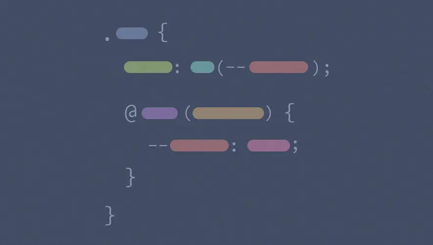
First, we set the font-size of .card__title to a variable that hasn’t been declared yet. Let’s call it --card-title-font-size just to be clear which block and property this variable is used for:
.card__title {
 …
 font-size: var(--card-title-font-size);
 …
}
Next, we write a media query like we always do, but inside of this media query, we’re going to set the value of the --card-title-font-size variable to achieve our desired look:
.card__title {
 …
 font-size: var(--card-title-font-size);
 …

 @media (min-width: 900px) {
 --card-title-font-size: 28px;
 }
}
Now, everything should work exactly as it did before, but we see our main .card__title block clearly indicates our font-size value can change. Note that we could declare this variable in :root, but for component-level variables, this nested syntax is the equivalent of setting it directly in .card__title, which scopes the variable to this classname.
But, this brings up an interesting question: what’s the value of --card-title-font-size outside of the media query? We never set a default or fallback value for our custom property, and there’s nothing specified for viewports 899px wide and narrower. If you’re coming from JavaScript or another programming language, you might be wondering why this doesn’t produce an error, or at least why it’s not "undefined.”
Somehow, for viewports 899px wide and narrower, our font-size still looks like it’s inheriting as expected, so what’s going on here?
Validity of undeclared variables
To answer this, let’s quote directly from MDN:
"The classical CSS concept of validity, tied to each property, is not very useful in regard to custom properties. When the values of the custom properties are parsed, the browser doesn't know where they will be used, so must, therefore, consider nearly all values as valid.” —MDN Web Docs
If you take a second to think this over, it makes complete sense. CSS Custom Properties simply store a value, but there’s no context about the value’s intended function or use. As a result, the browser simply ignores the property font-size: var(--card-title-font-size); if our variable doesn’t have a value, and everything works as expected.
Taking it further
With the task of responsively styling our card’s title out of the way, let’s get some more serious practice. We can now tackle the media queries used on the main .card block to really start flexing those Responsive CSS Variable muscles! 💪
Again, we’re going to add properties to our main .card class and set them to variables that we’re going to declare in our media queries.
Same as before, we’re going to use some nicely named variables that identify which block and property the value relates to:
.card {
 margin-right: var(--card-margin-right);
 margin-left: var(--card-margin-left);
 margin-bottom: 20px;
 padding: var(--card-padding);
 width: var(--card-width);
 display: grid;
 grid-template-areas: var(--card-template-areas);
 grid-template-columns: var(--card-template-columns);
 grid-template-rows: var(--card-template-rows);
 grid-row-gap: 20px;
 grid-column-gap: var(--card-column-gap);
 align-items: var(--card-align-items);
 border: 1px solid #ddd;
 border-radius: 3px;
 overflow: hidden;
}
Next, we’ll trade out property names in each media query with a variable declaration:
.card {
 margin-right: var(--card-margin-right);
 margin-left: var(--card-margin-left);
 margin-bottom: 20px;
 padding: var(--card-padding);
 width: var(--card-width);
 display: grid;
 grid-template-areas: var(--card-template-areas);
 grid-template-columns: var(--card-template-columns);
 grid-template-rows: var(--card-template-rows);
 grid-row-gap: 20px;
 grid-column-gap: var(--card-column-gap);
 align-items: var(--card-align-items);
 border: 1px solid #ddd;
 border-radius: 3px;
 overflow: hidden;

 @media (max-width: 899px) {
 --card-width: 300px;
 --card-template-areas:
 "card__image card__image card__image"
 ". card__title ."
 ". card__body .";
 --card-template-columns: 20px 1fr 20px;
 --card-template-rows: auto;
 }

 @media (min-width: 640px) and (max-width: 899px) {
 --card-margin-right: 10px;
 --card-margin-left: 10px;
 }

 @media (min-width: 900px) {
 --card-padding: 20px 20px 0 20px;
 --card-width: 100%;
 --card-template-areas:
 "card__title card__image"
 "card__body card__image";
 --card-template-columns: 1fr 2fr;
 --card-template-rows: 1fr 3fr;
 --card-column-gap: 20px;
 --card-align-items: start;
 }
}
Once all our media queries are updated, our responsive card layout should function as planned. Reviewing our main .card CSS block, we can now quickly see all the properties of this component that we know are going to change, and have a better understanding of all the styles that can affect this layout.
Some final considerations
Why not just use normal CSS properties in media queries?
You sure can! But, there are some interesting benefits to using Responsive CSS Variables that we discovered above, including:
- Having a main CSS block that shows all properties affecting the component
- Being able to quickly predict which variables will change responsively
- Making sure you’re not overriding values in media queries (the main block only refers to a variable, but doesn’t set a value that will be overridden)
There’s also much more you can make possible that we didn’t explore, such as using global variables to responsively change common spacing values, typography properties, or other concerns that often have to update the entire UI at certain breakpoints.
Why wouldn’t you use Responsive CSS Variables?
As awesome as this approach is, it does rely on having the appropriate browser support for CSS variables/CSS custom properties to be able to use this responsibly in production. Even with tools like simple vars for PostCSS that compile variables into actual set values for backwards compatibility, the way we’re using variables dynamically means this won’t work.
Additionally, this is still an opinionated approach. The organizational benefits of using Responsive CSS Variables are subjective, and some teams might just prefer the standard media query approach to responsive design. At DockYard, we’re going to start using this approach in projects where we have the correct browser support targets, and I’m sure we’ll learn a lot along the way.
Now get out there and experiment!
With the knowledge we’ve gained in this mini-series, go explore how you can apply these new CSS techniques to make even more awesome things a reality. And, as we keep getting new features to style our sites, remember to always explore what is now possible at the component-level as well.
