
Introduction
In this article, we are going to analyze ORC data for sailboats, and look into how we can create polar plots in Elixir through VegaLite.
What exactly is polar data?
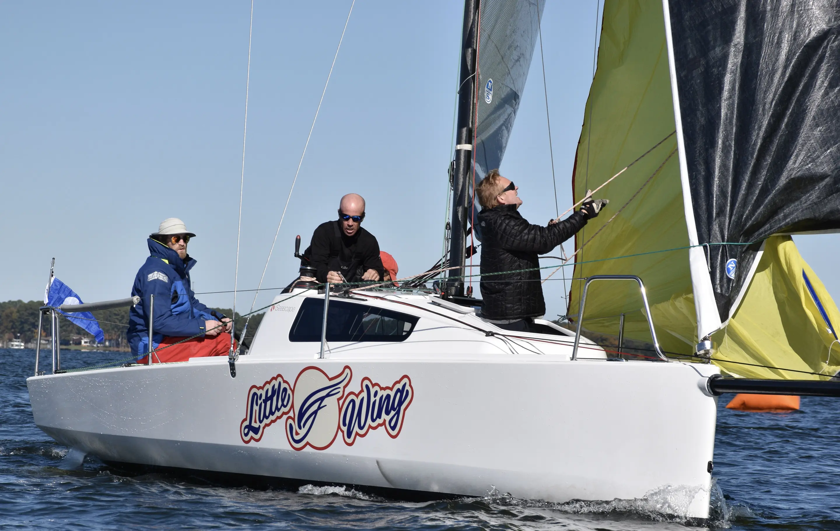
We'll use Brian's sailboat, LittleWing, as the example data set. LittleWing is a Beneteau First 24 SE. A few years ago Brian had his boat measured and some predictive performance data generated based upon those measurements. In sailing these are called "Polars" as they're mapped on a polar coordinate system and will show how fast the boat should go for a given wind speed and angle of attack. However, these datasets are typically sparse and don't contain a comprehensive range of values. Below we have a table from LittleWing's polar package that represents the boat's speed potential given the wind speed (True Wind Speed, or TWS) and the angle of attack with respect to the wind direction (True Wind Angle, or TWA).
| TWS by TWA | 40º | 50º | 60º | 70º | 80º | 90º | 100º | 110º | 120º |
|---|---|---|---|---|---|---|---|---|---|
| 6kts | 4.4 | 5.1 | 5.59 | 5.99 | 6.20 | 6.37 | 6.374 | 6.25 | 6.02 |
| 8kts | 5.41 | 6.05 | 6.37 | 6.54 | 6.72 | 6.88 | 6.99 | 6.98 | 6.77 |
| 10kts | 5.93 | 6.38 | 6.68 | 6.9 | 7.1 | 7.2 | 7.35 | 7.48 | 7.37 |
The fact that we have multiple functions that relate a value to an angle (3, in the example above) tells us that we're looking at multiple sets of polar data. A polar plot is a circular plot in which each point is represented by an angle (commonly called theta, the greek alphabet letter) and an absolute distance (commonly called r, for radius).
How to plot polar data
Now that we have a dataset in our hands, we can use VegaLite to visualize it. For this, we need to deal with the fact that the underlying vega-lite JS library doesn't support polar plots. It does, however, support arc plots and normal cartesian line plots separately. We can also take advantage of the layering concept it exposes to build our custom polar plot visualization.
First, we need to install the dependencies:
Mix.install([
 {:kino_vega_lite, "~> 0.1.3"},
 {:jason, "~> 1.2"} # Jason is needed for the SVG export we'll use.
])
Creating the grid
With the dependencies installed, we can start creating our PolarPlot module which will handle the grid generation and data plotting.
First, let's take a look into how we generate the polar grid.
defmodule PolarPlot do
 alias VegaLite, as: Vl

 def plot_grid(opts \\ []) do
 opts =
 Keyword.validate!(opts, [
 :height,
 :width,
 :color,
 :radius_marks,
 angle_marks: [0, 90, 180, 270],
 theta_offset: 0,
 opacity: 0.5,
 stroke_color: "white",
 stroke_opacity: 1
 ])

 width = height = max(opts[:height], opts[:width])

 grid_layers = angle_layers(opts)
 radius_layers = radius_layers(opts)

 Vl.new(height: height, width: width)
 |> Vl.data_from_values(%{_r: [1]})
 |> Vl.layers(grid_layers ++ radius_layers)
 end
The plot_grid function receives a keyword list that configures the plot. This module uses the Keyword.validate! function from Elixir 1.13 to ensure the options are passed correctly.
Then, we can take a look at our angle_layers and radius_layers functions separately.
 defp rad(angle), do: angle * :math.pi() / 180

 defp angle_layers(opts) do
 angle_marks_input = opts[:angle_marks]
 theta_offset = opts[:theta_offset]

 angle_marks = [0 | Enum.sort(angle_marks_input)] |> Enum.map(fn x -> x + theta_offset end)
 angle_marks2 = tl(angle_marks) ++ [360 + theta_offset]

 [angle_marks, angle_marks2]
 |> Enum.zip_with(fn [t, t2] ->
 label =
 if t != 0 or (t == 0 and 0 in angle_marks_input) do
 Vl.new()
 |> Vl.mark(:text,
 text: to_string(t - theta_offset) <> "º",
 theta: "#{rad(t)}",
 radius: [expr: "min(width, height) * 0.55"]
 )
 else
 []
 end

 [
 Vl.new()
 |> Vl.mark(:arc,
 theta: "#{rad(t)}",
 theta2: "#{rad(t2)}",
 stroke: opts[:stroke_color],
 stroke_opacity: opts[:stroke_opacity],
 opacity: opts[:opacity],
 color: opts[:color]
 ),
 label
 ]
 end)
 |> List.flatten()
 end
The angle_layers function utilizes the angle marks parameters as well as the plot's graphical radius (inferred from the width and height of the plot) to plot a sequence of arcs that span a full circle, but stops at each entry in the angle_marks option. This will yield a graph with radial strokes.
 defp radius_layers(opts) do
 radius_marks = opts[:radius_marks]

 max_radius = Enum.max(radius_marks)

 {theta, theta2} = Enum.min_max(opts[:angle_marks])

 radius_marks_vl =
 Enum.map(radius_marks, fn r ->
 Vl.mark(Vl.new(), :arc,
 radius: [expr: "#{r / max_radius} * min(width, height)/2"],
 radius2: [expr: "#{r / max_radius} * min(width, height)/2 + 1"],
 theta: theta |> rad() |> to_string(),
 theta2: theta2 |> rad() |> to_string(),
 color: opts[:stroke_color],
 opacity: opts[:stroke_opacity]
 )
 end)

 radius_ruler_vl = [
 Vl.new()
 |> Vl.data_from_values(%{
 r: radius_marks,
 theta: Enum.map(radius_marks, fn _ -> :math.pi() / 4 end)
 })
 |> Vl.mark(:text,
 color: "black",
 radius: [expr: "datum.r * min(width, height) / (2 * #{max_radius})"],
 theta: :math.pi() / 2,
 dy: 10,
 dx: -10
 )
 |> Vl.encode_field(:text, "r", type: :quantitative)
 ]

 radius_marks_vl ++ radius_ruler_vl
 end
The radius_marks function serves two purposes. The first one is to plot concentric arcs of width 1 (represented in the variable radius_marks_vl). These arcs will serve as the radial dimension grid. The second purpose is that this function will also label said arcs, marking the values which each one represents.
This all means that the plot_grid function takes a base layer that marks the angles and subsequent layers that mark the radii to build a radial plot. Next, we'll understand how plot_data uses the cartesian plot to plot lines over this existing grid.
Plotting the data
We can obtain our grid base layer by calling grid_vl = PolarPlot.plot_grid(r, opts). Then, we can pass that layer into the plot_data function to generate our final polar plot.
To understand how the function works, one needs to understand that we can transform rectangular (cartesian) coordinates into polar coordinates and vice versa. The base formula for converting (r, theta) into (x, y) is x = r.cos(theta) and y = r.sin(theta).
The main highlights in the function below are that we calculate x_linear and y_linear with the aforementioned formula, and then calculate x and y using the 2D rotation matrix to account for the theta_offset option.
It is also important to note that we turn off all of the labels, axes, and grid so that only the plot itself is generated.
Also, the scale is such that the origin is placed at the center of the generated (hidden) grid, so that it coincides with the polar grid's center.
Finally, the data parameter is a list of tuples that contain the r and theta data for a given plot as well as the mark type and mark_options that should be used.
This will become useful for plotting interpolated data, which we'll look into in a future post. The :grouping and :legend_name options are used so we can group multiple data entries with the same color and to set the legend title accordingly.
def plot_data(vl, data, opts \\ []) do
pi = :math.pi()
legend_name = opts[:legend_name] || ""

theta_offset = opts[:theta_offset] || 0

radius_marks = opts[:radius_marks]
max_radius = Enum.max(radius_marks)

Vl.new()
|> Vl.config(style: [cell: [stroke: "transparent"]])
|> Vl.layers([
vl
| for {r_in, theta_in, mark, mark_opts} <- data do
grouping = mark_opts[:grouping]

Vl.new()
|> Vl.data_from_values(%{
:r => r_in,
:theta => theta_in,
legend_name => List.duplicate(grouping, length(theta_in))
})
|> Vl.transform(calculate: "datum.r * cos(datum.theta * #{pi / 180})", as: "x_linear")
|> Vl.transform(calculate: "datum.r * sin(datum.theta * #{pi / 180})", as: "y_linear")
|> Vl.transform(
calculate:
"datum.x_linear * cos(#{rad(theta_offset)}) - datum.y_linear * sin(#{rad(theta_offset)})",
as: "x"
)
|> Vl.transform(
calculate:
"datum.x_linear * sin(#{rad(theta_offset)}) + datum.y_linear * cos(#{rad(theta_offset)})",
as: "y"
)
|> Vl.mark(mark, mark_opts)
|> Vl.encode_field(:color, legend_name, type: :nominal)
|> Vl.encode_field(:x, "y",
type: :quantitative,
scale: [
domain: [-max_radius, max_radius]
],
axis: [
grid: false,
ticks: false,
domain_opacity: 0,
labels: false,
title: false,
domain: false,
offset: 50
]
)
|> Vl.encode_field(:y, "x",
type: :quantitative,
scale: [
domain: [-max_radius, max_radius]
],
axis: [
grid: false,
ticks: false,
domain_opacity: 0,
labels: false,
title: false,
domain: false,
offset: 50
]
)
|> Vl.encode_field(:order, "theta")
end
])
end
Plotting our first polar graph
Now that we understand the PolarPlot module we created, we can use it to plot the data we analyzed before.
The code below plots the data in the table above and saves it to an SVG file
opts = [
 theta_offset: 0,
 width: 600,
 height: 600,
 opacity: 0.5,
 stroke_color: "white",
 stroke_opacity: 0.5,
 angle_marks: [30, 45, 60, 75, 90, 105, 120],
 radius_marks: [4, 5, 6, 7, 8]
]

theta = Enum.to_list(40..120//10)

r6 = [4.4 , 5.1 , 5.59, 5.99, 6.20, 6.37, 6.374, 6.25, 6.02]
r8 = [5.41, 6.05, 6.37, 6.54, 6.72, 6.88, 6.99, 6.98, 6.77]
r10 = [5.93, 6.38, 6.68, 6.9, 7.1, 7.2, 7.35, 7.48, 7.37]

vl_grid = PolarPlot.plot_grid(opts)

data = [
 {r6, theta, :line, grouping: 6, point: true},
 {r8, theta, :line, grouping: 8, point: true},
 {r10, theta, :line, grouping: 10, point: true}
]

vl_data = PolarPlot.plot_data(vl_grid, data, [{:stroke_opacity, 1} | opts])

svg_contents = VegaLite.Export.to_svg(vl_data)
File.write("/tmp/plot.svg", svg_contents)

vl_data

We can see that because we only have a handful of points and the functions a plotted in a hidden cartesian grid, the graph just plot's straight lines between points instead of curves we would expect in a polar plot. We can improve on that through the :interpolate mark option:
...
data = [
 {r6, theta, :line, grouping: 6, point: true, interpolate: "natural"},
 {r8, theta, :line, grouping: 8, point: true, interpolate: "natural"},
 {r10, theta, :line, grouping: 10, point: true, interpolate: "natural"}
]
...
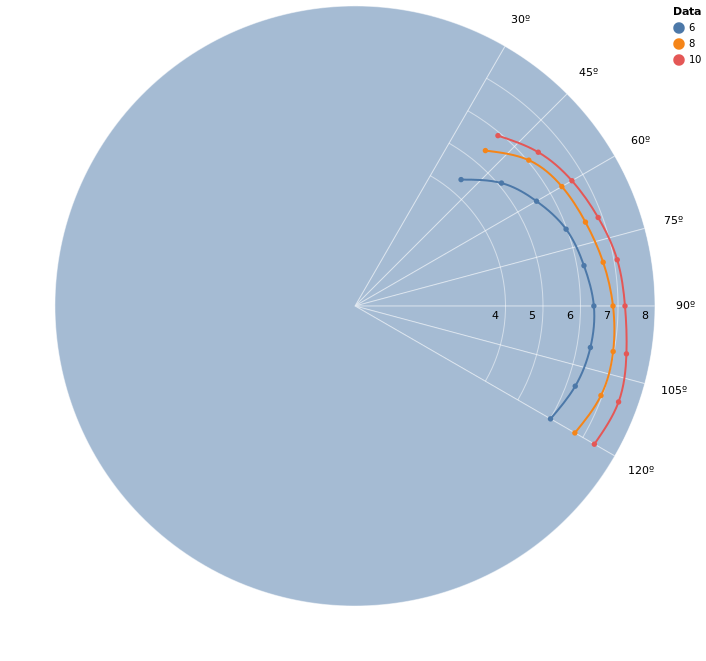
Now we have a graph that's closer to what we would expect. However, this doesn't let us retrieve the values of the smooth function nor can we extrapolate the data at the edges. This is where interpolation comes in. It uses algorithms that calculate inferred functions from the given points - in fact, in the next post we will be implementing the one used for the last plot.
