

Build your mobile app more efficiently with LiveView Native. Book a free consult today to learn how we can put it to work for you.
In this series we'll be building a simple LiveView Native app. The app will be SwiftUI, as of writing this, the Jetpack client is not yet ready.
For this part you will need the following:
- An Apple device to run your application (MacOS, iPhoneOS, or iPadOS)
- A working understanding of Elixir, Phoenix, and LiveView applications. This series will take for granted that you understand this stack already.
Your First App, Speedrun Edition
Clone the following repo: https://github.com/DockYard/lvn-counter-example
If you are creating a new Phoenix application or adding LVN to an existing one to following this guide you'll need to enable Phoenix for connections on your local network. If you clone the above mentioned repo then this change is already done for you in dev.exs:
     # Change to `ip: {0, 0, 0, 0}` to allow access from other machines.
---  http: [ip: {127, 0, 0, 1}, port: 4000],
+++  http: [ip: {0, 0, 0, 0}, port: 4000],
The LiveView Native dependencies have already been added to mix.exs. Run the following:
> mix deps.get
> mix lvn.setup.config
> mix lvn.setup.gen
> mix lvn.gen.live swiftui Home
You'll receive several prompts while running the LiveView Native setup tasks, you can just enter-smash your way through it.
If you are using live_view_native_stylesheet v0.3.0 there is a bug in one of the LiveView Native generated LiveReload patterns. Edit config/dev.exs
    config :counter, CounterWeb.Endpoint,
      live_reload: [
        patterns: [
          ~r"priv/static/(?!uploads/).*(js|css|png|jpeg|jpg|gif|svg)$",
          ~r"priv/gettext/.*(po)$",
          ~r"lib/counter_web/(controllers|live|components)/.*(ex|heex)$",
          ~r"lib/counter_web/(live|components)/.*neex$",
---       ~r"lib/counter_web/styles/*.ex$",
+++       ~r"lib/counter_web/styles/.*ex$",
          ~r"priv/static/*.styles$"
        ]
      ]
Now that everything is generated you'll need to add support for LiveView Native to lib/counter_web/live/home_live.ex
    defmodule CounterWeb.HomeLive do
      use CounterWeb, :live_view
+++   use CounterNative, :live_view
That LOC is necessary for every LiveView you want to enable for LiveView Native. That module will instruct the LiveView to delegate to a format-specific render function. LVN client requests come in with _format={type} query params. LVN negotiates the content type and will inject an on_mount/4 callback into the LiveView that determines the correct render module to delegate to. In this case because we are only using SwiftUI the render module for CounterWeb.HomeLive is CounterWeb.HomeLive.SwiftUI. We generated that module along with a corresponding template located at web/live/swiftui/home_live.swiftui.neex.
Next, download LVN Go from the AppStore on either a MacOS device, iPhone, or iPad (more compilations targets coming in the future). This particular guide is designed for iPhone and iPad.
Start the Counter app:
> mix phx.server
Launch the LVN Go app on your device navigate to the IP address:port of the Phoenix app.
Note: LVN Go has the same network restrictions as any other app on your network.
You'll now see a blank screen:
Back in the Phoenix app edit the following: lib/counter_web/live/swiftui/home_live.swiftui.neex
<Text>My first LiveView Native App!</Text>
save the file and you will see LVN Go automatically refresh with the new UI:
Let's add some interactivity.
If you were to look at the HomeLive module you'll notice that it already comes with counter example setup for HTML. Go ahead and open the web app:
You'll see a simple LiveView app that presents a counter value and an increment button. It's already wired up, you can try it out.
Let's build a native UI for this app. Edit lib/counter_web/live/swiftui/home_live.swiftui.neex again and replace the contents:
<VStack>
  <Text><%= @counter %></Text>
  <Button phx-click="incr">+1</Button>
</VStack>
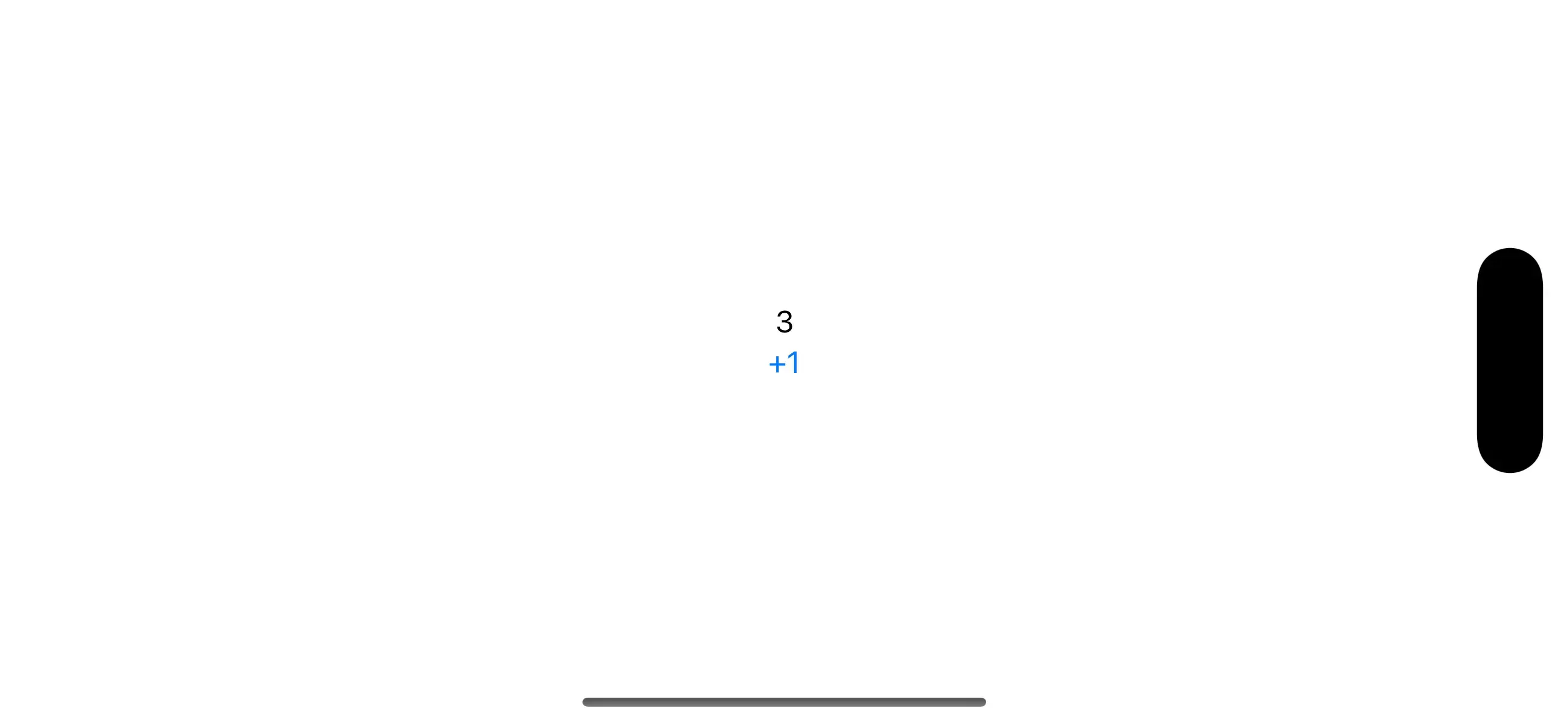
LVN re-renders quickly and now you have a functioning interactive native application that coordinates with a server in less that 5 minutes. Let's see somebody beat that!
Adding New Functionality
Let's add support for decrementing the counter. We'll need the event handler defined. Add this to lib/counter_web/live/home_live.ex:
def handle_event("decr", _unsigned_params, socket) do
  {:noreply, assign(socket, :counter, socket.assigns.counter - 1)}
end
and we can add the button for this in lib/counter_web/live/home_live.swiftui.neex
<VStack>
  <Text><%= @counter %></Text>
  <HStack>
    <Button phx-click="decr">-1</Button>
    <Button phx-click="incr">+1</Button>
  </HStack>
</VStack>

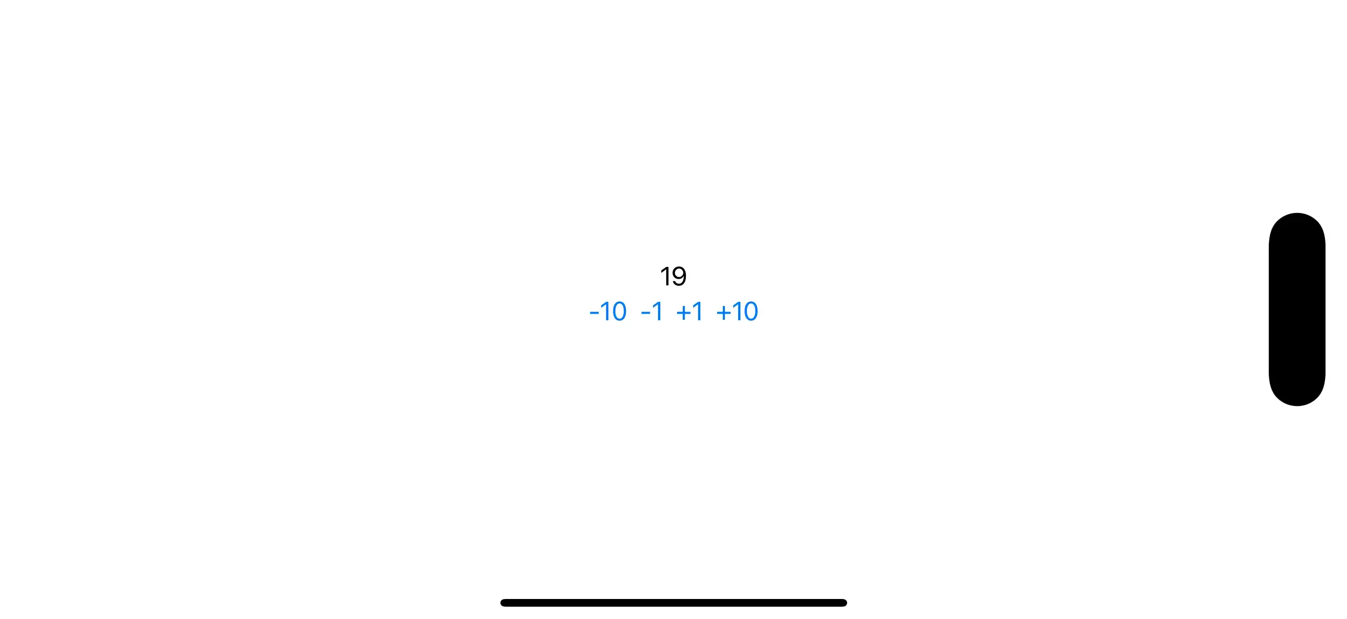
Let's add buttons for +/- 10:
def handle_event("incr-by", %{"by" => value}, socket) do
  {value, _} = Integer.parse(value)
  {:noreply, assign(socket, :counter, socket.assigns.counter + value)}
end
<VStack>
  <Text><%= @counter %></Text>
  <HStack>
    <Button phx-click="incr-by" phx-value-by="-10">-10</Button>
    <Button phx-click="decr">-1</Button>
    <Button phx-click="incr">+1</Button>
    <Button phx-click="incr-by" phx-value-by="10">+10</Button>
  </HStack>
</VStack>
Styling
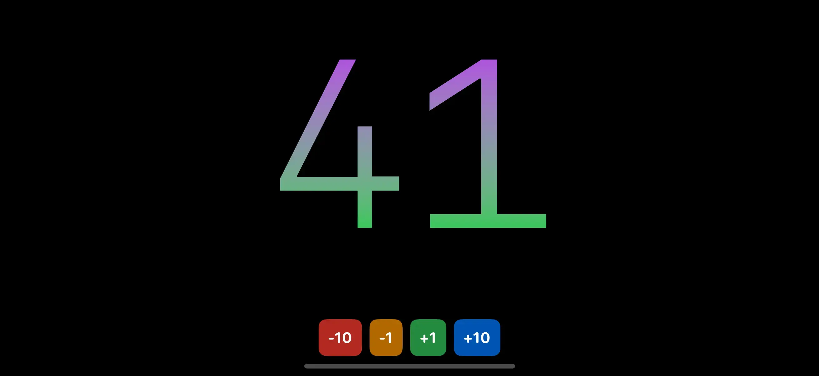
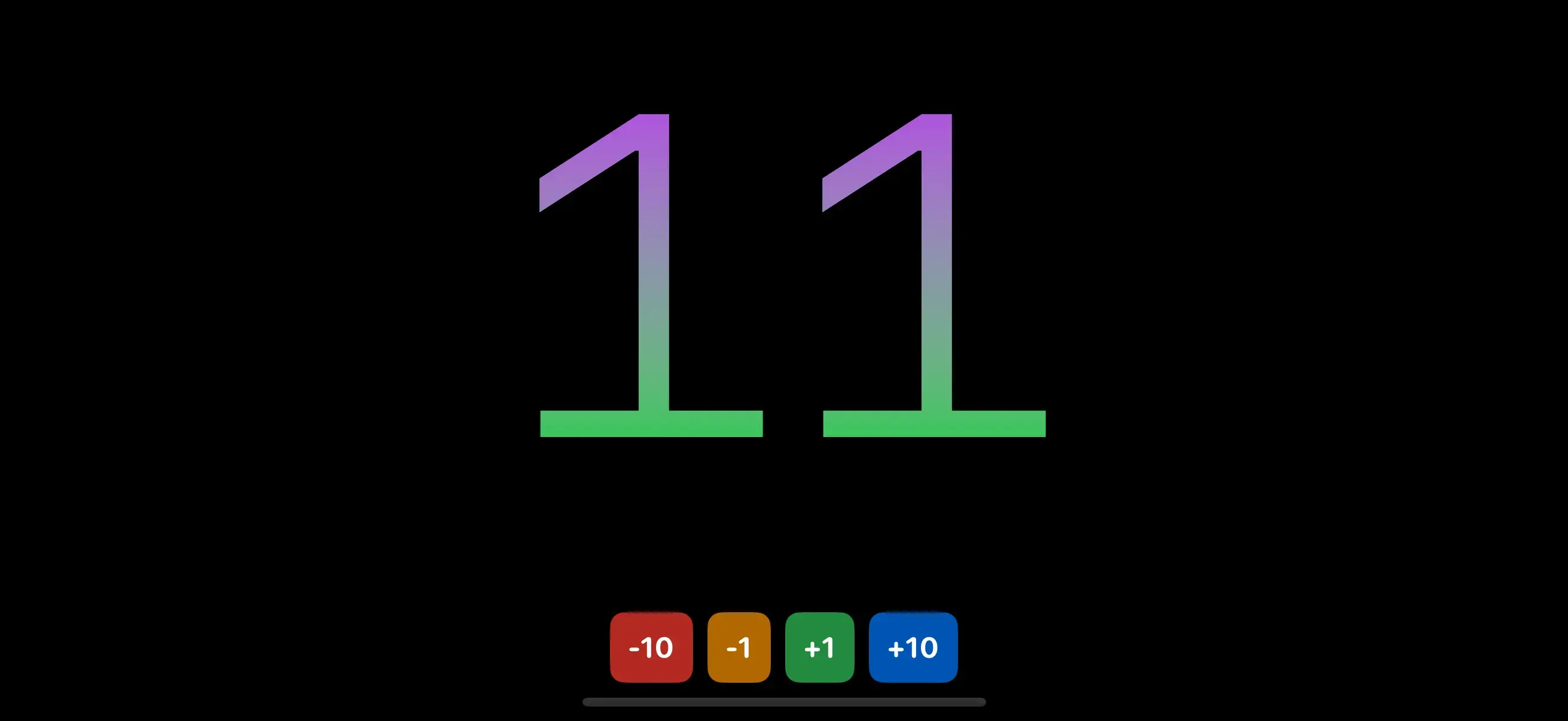
This app looks a little bland, let's add some styling and refactor all Buttons to use incr-by:
<ZStack>
  <Rectangle style="foregroundStyle(.black); ignoresSafeArea(.all);" />
  <VStack spacing="16">
    <Text style={"""
      font(.system(size: 300, weight: .regular, design: .monospaced));
      foregroundStyle(.linearGradient(colors: [.purple, .green], startPoint: .top, endPoint: .bottom));
      minimumScaleFactor(0.5);
      lineLimit(1);
      padding(.bottom, 20);
    """}><%= @counter %></Text>
  <HStack spacing="8">
    <Button
      phx-click="incr-by"
      phx-value-by="-10"
      style={"""
        font(.system(size: 16, weight: .bold, design: .rounded));
        padding(10);
        background(Color.red.opacity(0.7));
        foregroundStyle(.white);
        clipShape(.rect(cornerRadius: 8))
      """}
    >
    -10
    </Button>
    <Button
      phx-click="incr-by"
      phx-value-by="-1"
      style={"""
        font(.system(size: 16, weight: .bold, design: .rounded));
        padding(10);
        background(Color.orange.opacity(0.7));
        foregroundStyle(.white);
        clipShape(.rect(cornerRadius: 8))
      """}
     >
    -1
    </Button>
    <Button
      phx-click="incr-by"
      phx-value-by="1"
      style={"""
        font(.system(size: 16, weight: .bold, design: .rounded));
        padding(10);
        background(Color.green.opacity(0.7));
        foregroundStyle(.white);
        clipShape(.rect(cornerRadius: 8))
      """}
    >
    +1
    </Button>
    <Button
      phx-click="incr-by"
      phx-value-by="10"
      style={"""
        font(.system(size: 16, weight: .bold, design: .rounded));
        padding(10);
        background(Color.blue.opacity(0.7));
        foregroundStyle(.white);
        clipShape(.rect(cornerRadius: 8))
      """}
    >
    +10
    </Button>
    </HStack>
  </VStack>
</ZStack>
Let's DRY this up a bit, there's a lot of repetition of the styles on each of the Button views. What you'd do on the web is extract these styles into a CSS class defined in a stylesheet. We're going to do exactly this with LiveView Native's stylesheets. Open up lib/counter_web/styles/app.swiftui.ex
Add the following within the ~SHEET sigil:
~SHEET"""
"button" do
  font(.system(size: 16, weight: .bold, design: .rounded))
  padding(10)
  background(Color.red.opacity(0.7))
  foregroundStyle(.white)
  clipShape(.rect(cornerRadius: 8))
end
"""
Note the lack of ; at the end of each rule, this will change in v0.4 to optionally allow for semi-colons, in v0.3 their use in this module will error.
Let's update the markup:
<ZStack>
  <Rectangle style="foregroundStyle(Color.black); ignoresSafeArea(.all);"/>
  <VStack spacing="16">
    <Text style={"""
      font(.system(size: 300, weight: .regular, design: .monospaced));
      foregroundStyle(.linearGradient(colors: [.purple, .green], startPoint: .top, endPoint: .bottom));
      minimumScaleFactor(0.5);
      lineLimit(1);
      padding(.bottom, 20);
    """}><%= @counter %></Text>
    <HStack spacing="8">
      <Button class="button" phx-click="incr-by" phx-value-by="-10">
        -10
      </Button>
      <Button class="button" phx-click="incr-by" phx-value-by="-1">
        -1
      </Button>
      <Button class="button" phx-click="incr-by" phx-value-by="1">
        +1
      </Button>
      <Button class="button" phx-click="incr-by" phx-value-by="10">
        +10
      </Button>
    </HStack>
  </VStack>
</ZStack>
Unfortunately we've lost the unique color on each button. With LVN Stylesheets we can pattern match in the class names. Update the stylesheet:
~SHEET"""
--- "button" do
+++ "button-" <> color do
      font(.system(size: 16, weight: .bold, design: .rounded))
      padding(10)
---   background(Color.red.opacity(0.7))
+++   background(Color.{color}.opacity(0.7))
      foregroundColor(.white)
      clipShape(.rect(cornerRadius: 8))
    end
"""
We'll go more in-depth on stylesheets in a future blog post. But for now, just know that we can leverage the power of Elixir's pattern matching to create dynamic class names. In this case any values after button- will be captured into the color variable. The { ... } syntax on the background modifier is our interpolation syntax. Now we can update our markup to use dynamic class names:
<ZStack>
  <Rectangle style="foregroundStyle(Color.black); ignoresSafeArea(.all);"/>
  <VStack spacing="16">
    <Text style={"""
      font(.system(size: 300, weight: .regular, design: .monospaced));
      foregroundStyle(.linearGradient(colors: [.purple, .green], startPoint: .top, endPoint: .bottom));
      minimumScaleFactor(0.5);
      lineLimit(1);
      padding(.bottom, 20);
    """}><%= @counter %></Text>
    <HStack spacing="8">
      <Button class="button-red" phx-click="incr-by" phx-value-by="-10">
        -10
      </Button>
      <Button class="button-orange" phx-click="incr-by" phx-value-by="-1">
        -1
      </Button>
      <Button class="button-green" phx-click="incr-by" phx-value-by="1">
        +1
      </Button>
      <Button class="button-blue" phx-click="incr-by" phx-value-by="10">
        +10
      </Button>
    </HStack>
  </VStack>
</ZStack>
Refactoring
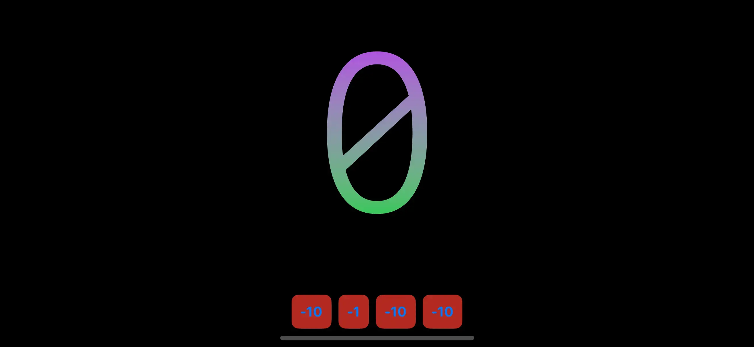
Let's start refactoring the app by extracting the background and counter's styling into classes.
~SHEET"""
  "background-" <> color do
    foregroundStyle(Color.{color})
    ignoresSafeArea(.all)
  end

  "counter" do
    font(.system(size: 300, weight: .regular, design: .monospaced))
    foregroundStyle(
      .linearGradient(
        colors: [.purple, .green],
        startPoint: .top,
        endPoint: .bottom
      )
    )
    minimumScaleFactor(0.5)
    lineLimit(1)
    padding(.bottom, 20)
  end

  "button-" <> color do
<ZStack>
  <Rectangle class="background-black"/>
  <VStack spacing="16">
    <Text class="counter"><%= @counter %></Text>
    <HStack spacing="8">
      <Button class="button-red" phx-click="incr-by" phx-value-by="-10">
        -10
      </Button>
      <Button class="button-orange" phx-click="incr-by" phx-value-by="-1">
        -1
      </Button>
      <Button class="button-green" phx-click="incr-by" phx-value-by="1">
        +1
      </Button>
      <Button class="button-blue" phx-click="incr-by" phx-value-by="10">
        +10
      </Button>
    </HStack>
  </VStack>
</ZStack>
If this is feeling very familiar, that is by design. Our markup, our stylesheets, how inline styling works; LVN is intended to build on top of your existing knowledge of HTML, CSS, and HEEx templates
Let's continue refactoring by extracting the Button elements into a single function component. We'll add that function component to counter_web/live/home_live.swiftui.ex
def counter_button(assigns) do
  ~LVN"""
  <Button class={@class} phx-click="incr-by" phx-value-by={@value}>
    <%= if @value < 0 do %>
      <%= @value %>
    <% else %>
      +<%= @value %>
    <% end %>
  </Button>
  """
end
<ZStack>
  <Rectangle class="background-black"/>
  <VStack spacing="16">
    <Text class="counter"><%= @counter %></Text>
    <HStack spacing="8">
      <.counter_button class="button-red" value={-10} />
      <.counter_button class="button-orange" value={-1} />
      <.counter_button class="button-green" value={1} />
      <.counter_button class="button-blue" value={10} />
    </HStack>
  </VStack>
</ZStack>
Now let's improve the styling of the buttons making the text a linear gradient of the custom color surrounded by a thin circle an transparent interior. Add the following to the stylesheet and be sure to replace the previous implementation of "button-" <> color.
"button-border" do
  stroke(.gray, lineWidth: 2)
end

"button-" <> color do
  font(.system(size: 16, weight: .bold, design: .monospaced))
  frame(width: 50, height: 50)
  foregroundStyle(
    .linearGradient(
      colors: [.white, .{color}],
      startPoint: .top,
      endPoint: .bottom
    )
  )
  overlay(content: :border)
  background(Color.clear)
  clipShape(.circle)
end
Note how "button-border" is defined before "button-" <> color because we rely on Elixir's pattern matching first match wins, make sure greedy matchers are defined last.
    def counter_button(assigns) do
      ~LVN"""
      <Button class={@class} phx-click="incr-by" phx-value-by={@value}>
+++     <Circle class="button-border" template="border" />
        <%= if @value < 0 do %>
          <%= @value %>
        <% else %>
          +<%= @value %>
        <% end %>
      </Button>
      """
    end
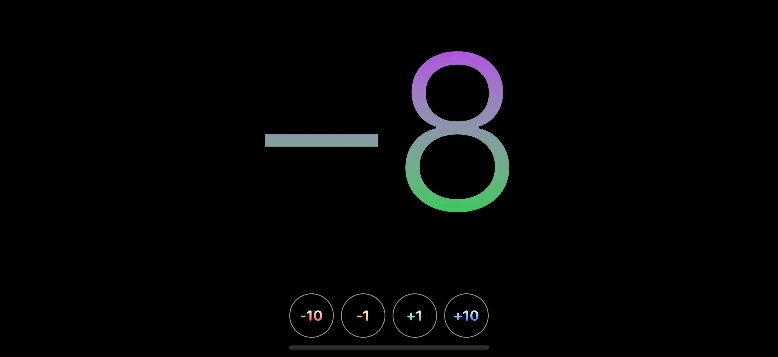
The Circle element has a template= attribute. This is a special attribute in LVN. If you look back at the new styles added to "button-" <> color you'll see overlay(content: :border). In SwiftUI modifiers can render views directly:
Button("+10") {
  counter += 10
}
.overlay() {
  Circle()
    .stroke(.gray, lineWidth: 2)
}
We represent this in LVN with content references. In this case overlay(content: :border) references the "border" template. If a direct child element of the element the modifier is being applied to has a template attribute with the matching value it will be used. Elements with template= attributes will not be rendered unless a modifier requires it.
That's it for now. Go ahead and play around with the app and see what you can create before moving onto the next part. Be sure to share screenshots of your first LiveView Native app on Twitter and be sure to tag @liveviewnative!
In the next part of this series we'll build a form.
