

Build your mobile app more efficiently with LiveView Native. Book a free consult today to learn how we can put it to work for you.
Read the first part in this series, Create Your First LiveView Native App - Part 1.
This part will be working from the repo found here. You will want to check out the branch for this post, 1.1: git checkout 1.1
If you did Part 1 prior to Oct 2, 2024 you should replace your code with the 1.1 branch in the repo as two changes were made to that post. The first being a correction of the spelling monospace in the styles and changing the counter's font weight from .light to .regular as that was causing some rendering artifacts on MacOS.
Before we start on the promised Part 2 - Forms for this series we need to address an oversight from Part 1. That oversight is this:
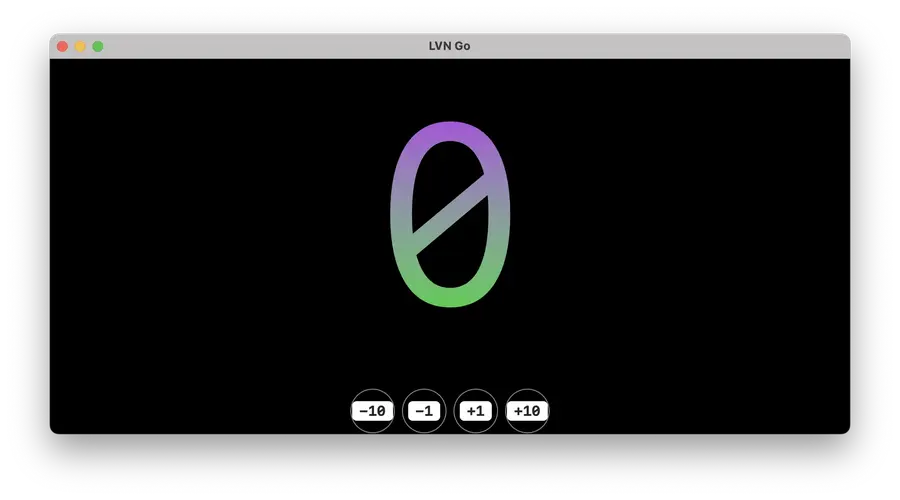
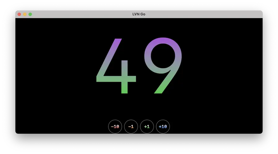
That is a screenshot of LVN Go running on MacOS. It's from the exact same SwiftUI template that renders this way on iOS:
As you begin to navigate SwiftUI one thing you'll come to understand is that applications don't render the same way on each Apple device. There are certain modifiers and views that don't exist on one device's compilation of SwiftUI but do exist on another's. There are views and modifiers that render a completely different way from one device to another. LiveView Native has a way to address this, let's check it out!
Device-Specific Templates
When a LVN client connects to the LiveView server it sends along with it a query param called _interface. This QP is a map of all sorts of device specific information. As of this writing it includes:
app_versionapp_buildbundle_idosos_versiontargetl10ni18n
You can see the interface params defined here in the SwiftUI client.
In this case we care about the target, which can be one of the following values in the SwiftUI LVN client:
iosipadosmacostvoswatchosvisionos
We also support maccatalyst and unknown but these really shouldn't be used.
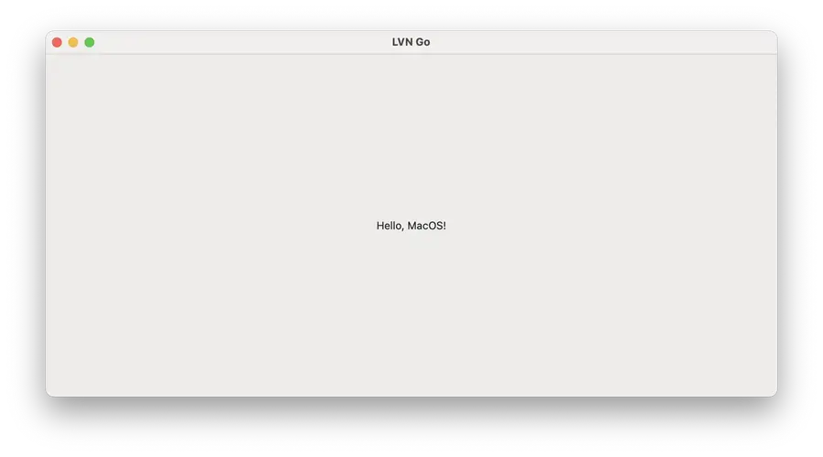
Go ahead and open up lib/counter_web/live/home_live.swiftui.ex and add the following:
def render(assigns, %{"target" => "ios"} do
   ~LVN"""
   <Text>Hello, iOS!</Text>
   """
end

def render(assigns, %{"target" => "macos"}) do
   ~LVN"""
   <Text>Hello, MacOS!</Text>
   """
end

def render(assigns, _interface) do
   ~LVN"""
   <Text>You did not use a Mac or iPhone!</Text>
   """
end
(if you have an iPad you can just change one of the target names to ipados)
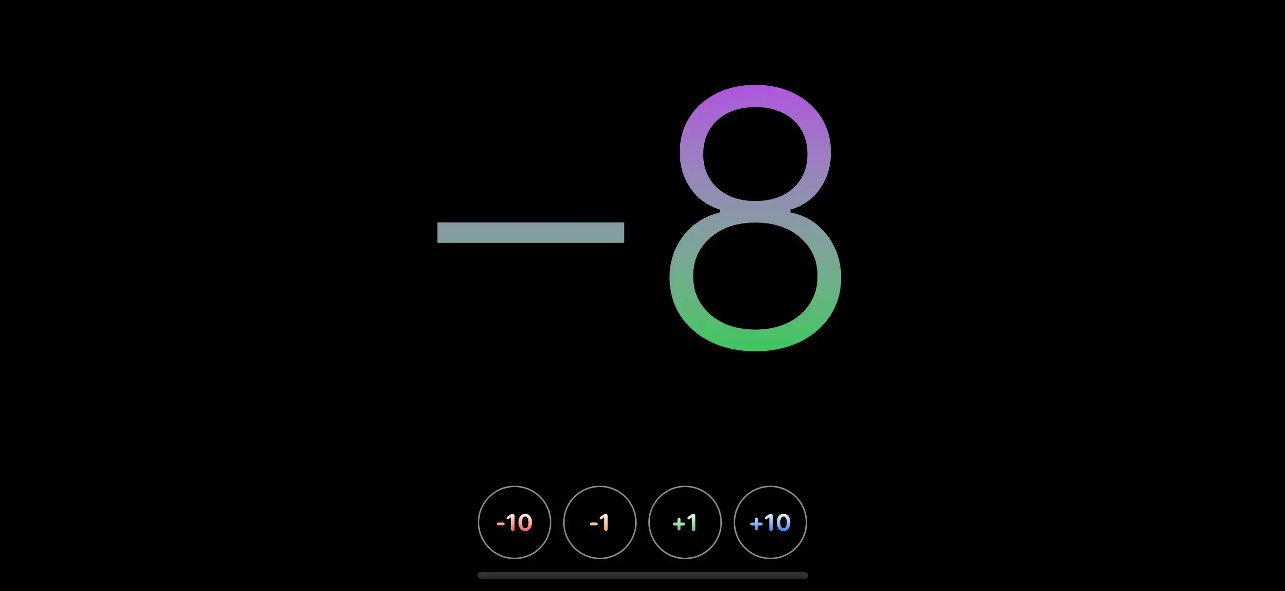
Assuming you have access to both an iPhone and a Mac you should see the following on each device:

We can rely on the power of Elixir's pattern matching to easily build device-specific templates. This further extends the value of LiveView Native. Imagine now instead of writing state and event management for just web and a single Apple device you can now do so for every device type and provide templates that are curated specifically for that device. If the target value is unmatched it will render the fallback.
You may be wondering what render/2 is? It's LiveView Native's special render function. In fact, there's nothing really special about it. We simply inject our own render/1 that extracts the interface map from the assigns and calls render(assigns, interface)
Some people like using the in-line render/2 function, some like using external templates. We have a convention for this as well. You will need to first remove the render/2 functions we previously defined, those will always supersede any template files, similar to LiveView.
Next let's add the following files:
lib/counter_web/live/swiftui/home_live.swiftui+ios.neexlib/counter_web/live/swiftui/home_live.swiftui+macos.neex
Note the filename's format segment convention: swiftui+ios or <format>+<target>. This will extend for other clients and their targets as well. Go ahead and update those templates with the device-specific templates from above's example. Similar to the fallback function from above the already defined lib/counter_web/live/swiftui/home_live.swiftui.neex template is the fallback.
The Mac and iPhone apps should be showing their device-specific renderings. Let's copy the contents of the fallback template into both of the device-specific templates:
<ZStack>
  <Rectangle class="background-black"/>
  <VStack spacing="16">
    <Text class="counter"><%= @counter %></Text>
    <HStack spacing="8">
      <.counter_button class="button-red" value={-10} />
      <.counter_button class="button-orange" value={-1} />
      <.counter_button class="button-green" value={1} />
      <.counter_button class="button-blue" value={10} />
    </HStack>
  </VStack>
</ZStack>
Now we're back at the beginning where the iPhone is rendering the counter app button correctly but Mac is not rendering correctly. Just for good practice, you should always have a fallback template. In this case the fallback is the file that doesn't have +<target> in the format segment lib/counter_web/live/swiftui/home_live.swiftui.neex:
<Text>This is the fallback, it should not render.</Text>
Fixing for Mac
In this case the solution will be pretty easy. SwiftUI buttons will render differently on Mac than they will on iPhone. Let's fix that. We're going to start by modifying lib/counter_web/live/swiftui/home_live.swiftui+macos.neex
--- <.counter_button class="button-red" value={-10} />
--- <.counter_button class="button-orange" value={-1} />
--- <.counter_button class="button-green" value={1} />
--- <.counter_button class="button-blue" value={10} />
+++ <.counter_button class="macos:button-red" value={-10} />
+++ <.counter_button class="macos:button-orange" value={-1} />
+++ <.counter_button class="macos:button-green" value={1} />
+++ <.counter_button class="macos:button-blue" value={10} />
We simply prepend each of the class names with macos:. I want to call out that this is not a configuration in LiveView Native, it does nothing other than get evaluated as a string that you have to match on in the stylesheet. We could have called it giraffe: and get the same result we will in a moment.
Your app will now render like so:
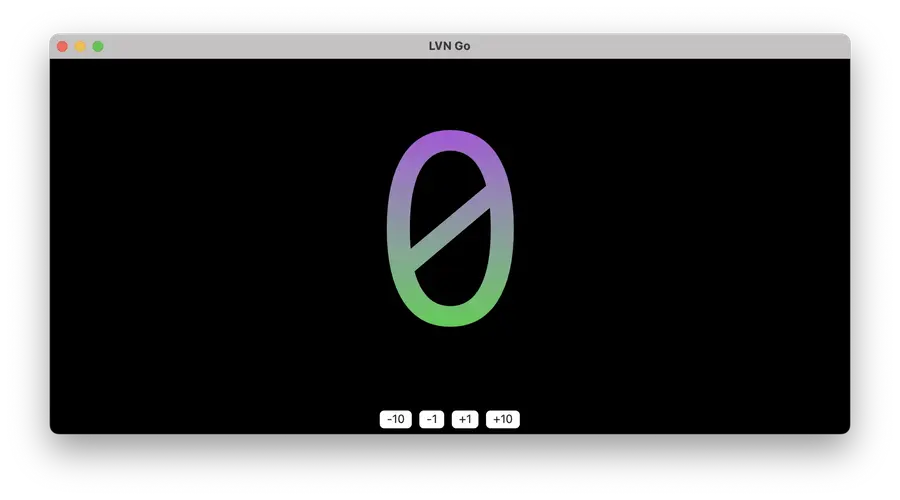
This is because the new class name is not matching on any defined styles. Open up lib/counter_web/styles/app.styles.ex and put the following before your definition of "button-" <> color
"macos:button-" <> color do
  buttonStyle(.plain)
  font(.system(size: 16, weight: .bold, design: .monospaced))
  frame(width: 50, height: 50)
  foregroundStyle(
    .linearGradient(
      colors: [.white, .{color}],
      startPoint: .top,
      endPoint: .bottom
    )
  )
  overlay(content: :border)
  background(Color.clear)
  clipShape(.circle)
end
Note buttonStyle(.plain) as being the primary difference in this set of styles from the previous one. Now our MacOS app renders correctly!
However, target-specific styles are not ideal. It means our stylesheets may not be as optimized as they could be because styles that have nothing to do with the target device are being included. You can imagine how bloated this gets if we have a single stylesheet that included variants for iPhone, iPad, Apple Watch, Apple TV, etc...
Device-Specific Stylesheets
We can use the lesson we learned earlier in this post about device-specific templates and apply it to the stylesheets. The first thing we'll need to do is create a MacOS specific root template. Copy the contents of lib/counter_web/components/layouts_swiftui/root.swiftui.neex into lib/counter_web/components/layouts_swiftui/root.swiftui+macos.neex and change the following:
    <.csrf_token />
--- <Style url={~p"/assets/app.swiftui.styles"} />
+++ <Style url={~p"/assets/app.swiftui+macos.styles"} />
    <NavigationStack>
      <%= @inner_content %>
    </NavigationStack>
Next copy the contents of lib/counter_web/styles/app.swiftui.ex into a new file: lib/counter_web/styles/app.swiftui+macos.ex and changed the module name in the file to CounterWeb.Styles.App.SwiftUI.MacOS. Remove the class definition for "button-" <> color and rename "macos:button-" <> color to "button-" <> color. The new stylesheet file should be identical to this:
defmodule CounterWeb.Styles.App.SwiftUI.MacOS do
  use LiveViewNative.Stylesheet, :swiftui

  # Add your styles here
  # Refer to your client's documentation on what the proper syntax
  # is for defining rules within classes
  ~SHEET"""
  "background-" <> color do
    foregroundStyle(Color.{color})
    ignoresSafeArea(.all)
  end

  "counter" do
    font(.system(size: 300, weight: .regular, design: .monospaced))
    foregroundStyle(
      .linearGradient(
        colors: [.purple, .green],
        startPoint: .top,
        endPoint: .bottom
      )
    )
    minimumScaleFactor(0.5)
    lineLimit(1)
    padding(.bottom, 20)
  end

  "button-border" do
    stroke(.gray, lineWidth: 2)
  end

  "button-" <> color do
    buttonStyle(.plain)
    font(.system(size: 16, weight: .bold, design: .monospaced))
    frame(width: 50, height: 50)
    foregroundStyle(
      .linearGradient(
        colors: [.white, .{color}],
        startPoint: .top,
        endPoint: .bottom
      )
    )
    overlay(content: :border)
    background(Color.clear)
    clipShape(.circle)
  end
  """

  # If you need to have greater control over how your style rules are created
  # you can use the function defintion style which is more verbose but allows
  # for more fine-grained controled
  #
  # This example shows what is not possible within the more concise ~SHEET
  # use `<Text class="frame:w100:h200" />` allows for a setting
  # of both the `width` and `height` values.

  # def class("frame:" <> dims) do
  #   [width] = Regex.run(~r/w(\d+)/, dims, capture: :all_but_first)
  #   [height] = Regex.run(~r/h(\d+)/, dims, capture: :all_but_first)

  #   ~RULES"""
  #   frame(width: {width}, height: {height})
  #   """
  # end
end
Update lib/counter_web/live/swiftui/home_live.swiftui+macos.neex to remove the macos: prepend on each of the button classes. The app should now be rendering on MacOS with a MacOS-specific template.
Now that the iPhone and MacOS templates are identical again, we can remove the two device-specific templates and roll back to the single template as the markup is cross-platform, but our styling rules are now device-specific.
LiveView Native provides many options for customizing the behavior and look of your applications. We are fighting against the flawed "Build Once, Run Anywhere" mantra. If you want to deliver high-quality applications for your customers that feel like they belong on that device you need to break out into device-specific UI.
Please share your experiences building with LiveView Native by at-mentioning @liveviewnative on Twitter!
Next time we'll do forms, I promise.
