Build your mobile app more efficiently with LiveView Native. Book a free consult today to learn how we can put it to work for you.
In the previous blog we built a simple counter app and styled it up. Then we demonstrated how to design device-specific templates to accommodate the different UI constraints of devices under the same platform family. Today we'll dive into forms.
As is the case with all of the parts in this series, we're building for iPhone. You can use another device but some of the renderings may look different.
For the remainder of this series we'll focus on the iPhone experience. You're welcome to use another Apple device (either with Xcode or LVN Go) but for the sake of simplicity it'll be iPhone from now on. You'll likely see a difference in how things render on another device but overall the applications should still work.
This part will be working from the repo found here: https://github.com/DockYard/lvn-counter-example you will want to check out the branch for this post, 2: git checkout 2
We're going to start today by creating a simple form and then add a few more form controls.
LiveForm
On the web the <form> element is special. When you submit a form it will serialize all of the data from the input elements that are children of the <form>. LiveView leverages this when doing phx-submit by serializing the data and pushing it back to the server. Unfortunately in native we don't have this functionality. You may have seen that SwiftUI has a Form but in SwiftUI this view is only for presentation purposes. Let's take a look at an example from the SwiftUI docs for Form:
Form {
    Section(header: Text("Notifications")) {
        Picker("Notify Me About", selection: $notifyMeAbout) {
            Text("Direct Messages").tag(NotifyMeAboutType.directMessages)
            Text("Mentions").tag(NotifyMeAboutType.mentions)
            Text("Anything").tag(NotifyMeAboutType.anything)
        }
        Toggle("Play notification sounds", isOn: $playNotificationSounds)
        Toggle("Send read receipts", isOn: $sendReadReceipts)
    }
    Section(header: Text("User Profiles")) {
        Picker("Profile Image Size", selection: $profileImageSize) {
            Text("Large").tag(ProfileImageSize.large)
            Text("Medium").tag(ProfileImageSize.medium)
            Text("Small").tag(ProfileImageSize.small)
        }
        Button("Clear Image Cache") {}
    }
}
And this will render as:
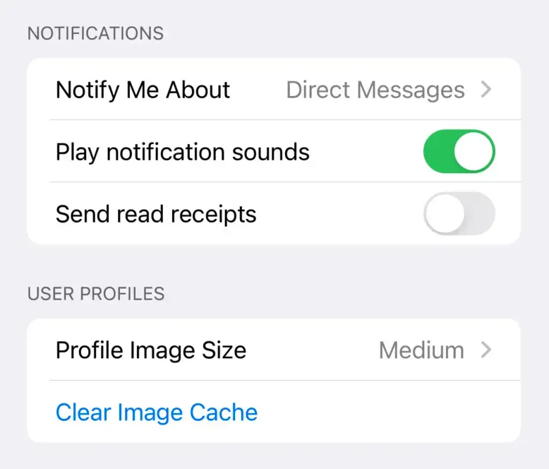
Which looks nice but provides no functionality. It is up to you to decide what happens when the Button is pressed. You must manually collect input values via variables bound to those inputs and send the data off to the server. This method doesn't work for LiveView Native because we want to re-purpose how LiveView is already expecting form data to be sent. We also cannot declare from the server how this would work. Instead, we need to bring a similar functionality from the web to native. This is where LiveForm comes in.
LiveForm is the first addon that we're introducing. Addons are a topic for its own blog post to expand upon but LiveView Native is built for extensibility. The scope of the SwiftUI client is only what is included in SwiftUI. For functionality such as MapKit or Swift Charts, these are provided as an addon. In future blog posts we'll explore these addons and how to write your own.
In LiveView Native with LiveForm where you would use <form> in HTML, you will now use <LiveForm>. Attributes should match what HTML has. Why not just <Form> ? Because as noted above, Form already exists in one or more native UI frameworks. Let's implement our first LiveForm and see how it compares to HTML.
Go ahead and check out branch 2 on the repo. You should now have a route for /form along with the following files:
lib/counter_web/live/form_live.exlib/counter_web/live/form_live.swiftui.ex
The root path has also been changed: live "/", FormLive. We'll switch this back towards the end of the article. This just makes it easier for you to point to the root path with LVN Go or if you're building with Xcode. The mount/3 and event handlers are already written for this part, you'll just be focusing on writing templates until later in the post.
The CounterWeb.FormLive module is already set up with an HTML implementation of a LiveView form. If you launch the server and navigate to /form you can test it out. Note the markup is completely unstyled so we can focus on the implementation similarities to LiveForm:
def render(assigns) do
  ~H"""
  <form phx-submit="save">
    <label for="username">Username</label>
    <input id="username" type="text" name="user[username]" />

    <label for="email">Email</label>
    <input id="email" type="email" name="user[email]"/>
    <button type="submit" >Save</button>
  </form>
  <p>Username: <%= @user.username %></p>
  <p>Email: <%= @user.email %></p>
  """
end
Now let's implement the LiveForm for the SwiftUI app. Open lib/counter_web/live/form_live.swift.ex and add the following render/2:
def render(assigns, _interface) do
  ~LVN"""
  <LiveForm id="1" phx-submit="save">
    <TextField id="username" name="user[username]">Username</TextField>
    <TextField id="email" name="user[email]">Email</TextField>
    <LiveSubmitButton>Save</LiveSubmitButton>
  </LiveForm>
  <Text>Username: <%= @user.username %></Text>
  <Text>Email: <%= @user.email %></Text>
  """
end
The attribute id="1" is necessary as of this writing but shouldn't be starting in v0.4.0 of live_view_native_swiftui.
Notice that the markup is nearly identical. Instead of <form> we use <LiveForm>. Instead of <input> we use <TextField> and, finally, instead of <button> we use <LiveSubmitButton>. As we have done with LiveView Native itself, we designed LiveForm to feel familiar to the forms you already know how to build. Go ahead and try the form on your native app, you'll see it works just like in HTML. One behavior difference (at the moment) is for naked forms; the HTML version will clear its state after submit, the LVN one will not. It's a known issue we will fix to ensure behavior is completely aligned. <LiveForm> should behave identically to the HTML <form>, so if you can reproduce any divergent behavior that is a bug, please open an issue.
Nobody really writes <form> in LiveView. Most people are using the <.form> component. Well, in LiveForm we provide the the exact same component: <.form>. Not only is our function component named the same but it also has the exact same attributes as the HTML one. Why?
While LiveView Native allows you to speed up development time by sharing state and event handling for all devices in one place, where it can be more time-consuming to build is in the templates. Because LiveView Native isn't a build-once-run-anywhere framework we allow for 1st class UI framework access, this means you will have to spend more time building each device's templates. Markup for similar functionality will have different names in each UI framework. For example, in HTML you have a <checkbox> that can represent a boolean state. In SwiftUI it is a <Toggle>. In Jetpack Compose it is a <Switch>. Finally, in WinUI3 it is <ToggleSwitch> They all have different attributes so this ends up being time-consuming to have to write each element out per platform. Function components allow us to abstract that away. We can normalize on function names and arguments but then render out the platform-specific element. With our version of <.form> we render out <LiveForm> configured in the same way that the HTML <.form> will configure <form>. Let's refactor the above templates to use <.form>:
Our HTML template:
def render(assigns) do
  ~H"""
  <.form for={@form} phx-submit="save">
    <label for="username">Username</label>
    <input id="username" type="text" name="user[username]" />

    <label for="email">Email</label>
    <input id="email" type="email" name="user[email]"/>
    <button type="submit" >Save</button>
  </.form>
  <p>Username: <%= @user.username %></p>
  <p>Email: <%= @user.email %></p>
  """
end
Our SwiftUI template:
def render(assigns, _interface) do
  ~LVN"""
  <.form id="1" for={@form} phx-submit="save">
    <TextField id="username" name="user[username]">Username</TextField>
    <TextField id="email" name="user[email]">Email</TextField>
    <LiveSubmitButton>Save</LiveSubmitButton>
  </.form>
  <Text>Username: <%= @user.username %></Text>
  <Text>Email: <%= @user.email %></Text>
  """
end
You shouldn't notice any visual differences in the rendering, but you should start to see the two templates beginning to look alike. Let's continue down this road by introducing LiveView Native's version of CoreComponents.
CoreComponents
We've now abstracted both templates' form implementation. But why stop there? In your Phoenix app you get CoreComponents which defines many convenience function components for rendering different common UI patterns. Right next to that file you'll see CoreComponents.SwiftUI and these are the exact same function component names with the exact same arguments only they render out the SwiftUI version for each UI component. The input/1 is more commonly used instead of writing <input /> when building LiveView forms. Let's refactor both templates again, this time implementing the input/1 function in place of each input element. We'll make use of button/1 as well.
Our HTML template:
def render(assigns) do
  ~H"""
  <.form for={@form} phx-submit="save">
    <.input field={@form[:username]} label="Username" />
    <.input field={@form[:email]} label="Email" />

    <.button type="submit" >Save</.button>
  </.form>
  <p>Username: <%= @user.username %></p>
  <p>Email: <%= @user.email %></p>
  """
end
Our SwiftUI template:
def render(assigns, _interface) do
  ~LVN"""
  <.form for={@form} id="1" phx-submit="save">
    <.input field={@form[:username]} label="Username" />
    <.input field={@form[:email]} label="Email" />

    <.button type="submit" >Save</.button>
  </.form>
  <Text>Username: <%= @user.username %></Text>
  <Text>Email: <%= @user.email %></Text>
  """
end
At this point the apps will be rendering with some styling. The advantages to this approach should be apparent: by leveraging function components as an abstraction layer we create a common language across all of the potential rendering targets for your LiveView applications, but Native and HTML. This allows development to move fast while still rendering device-specific markup.
Let's implement that form from the Apple documentation. This one:
Form {
    Section(header: Text("Notifications")) {
        Picker("Notify Me About", selection: $notifyMeAbout) {
            Text("Direct Messages").tag(NotifyMeAboutType.directMessages)
            Text("Mentions").tag(NotifyMeAboutType.mentions)
            Text("Anything").tag(NotifyMeAboutType.anything)
        }
        Toggle("Play notification sounds", isOn: $playNotificationSounds)
        Toggle("Send read receipts", isOn: $sendReadReceipts)
    }
    Section(header: Text("User Profiles")) {
        Picker("Profile Image Size", selection: $profileImageSize) {
            Text("Large").tag(ProfileImageSize.large)
            Text("Medium").tag(ProfileImageSize.medium)
            Text("Small").tag(ProfileImageSize.small)
        }
        Button("Clear Image Cache") {}
    }
}

To do this we'll introduce a few new views and the concept of the template attribute. We'll start with a pure markup implementation.
def render(assigns, _interface) do
  ~LVN"""
    <LiveForm id="1" phx-submit="save">
      <Form>
        <Section>
          <Text template={:header}>Notifications</Text>
          <Picker name="settings[notify_type]" selection={@settings.notify_type} phx-change="notify">
            <Text template={:label}>Notify Me About</Text>
            <Group template={:content}>
              <Text tag="direct">Direct Messages</Text>
              <Text tag="mentions">Mentions</Text>
              <Text tag="anything">Anything</Text>
            </Group>
          </Picker>
          <Toggle isOn={@settings.play} phx-change="toggle-play" name="settings[play]">Play notification sounds</Toggle>
          <Toggle idOn={@settings.read_receipts} phx-change="toggle-read_receipts" name="settings[read_receipts]">Send read receipts</Toggle>
        </Section>
        <Section>
          <Text template={:header}>User Profiles</Text>
          <Picker name="settings[image_size]" selection={@settings.image_size} phx-change="image-size">
            <Text template={:label}>Profile Image Size</Text>
            <Group template={:content}>
              <Text tag="large">Large</Text>
              <Text tag="medium">Medium</Text>
              <Text tag="small">Small</Text>
            </Group>
          </Picker>
          <Button>Clear Image Cache</Button>
        </Section>
      </Form>
    </LiveForm>
  """
end
And replace lib/counter_web/live/form_live.ex with the following:
defmodule CounterWeb.FormLive do
  use CounterWeb, :live_view
  use CounterNative, :live_view

  @impl true
  def mount(_params, _session, socket) do
    settings = %{"notify_type" => "direct", "image_size" => "medium", "play" => true, "read_receipts" => false}

    {:ok, assign(socket, settings: atomize_keys(settings), form: to_form(settings, as: :settings))}
  end

  @impl true
  def render(assigns), do: ~H""

  @impl true
  def handle_event("notify", %{"settings" => %{"notify_type" => notify_type}}, socket) do
    {:noreply, assign(socket, %{notify_type: notify_type})}
  end

  def handle_event("image-size", %{"settings" => %{"image_size" => image_size}}, socket) do
    {:noreply, assign(socket, %{image_size: image_size})}
  end

  def handle_event("toggle-" <> name, %{"settings" => params}, socket) do
    is_on =
      case params[name] do
        "true" -> true
        "false" -> false
      end

    {:noreply, assign(socket, [{String.to_atom(name), is_on}])}
  end

  defp atomize_keys(params) do
    for {key, val} <- params, into: %{}, do: {String.to_atom(key), val}
  end
end
Now you have a fully functioning LiveForm!
Before we refactor this using function components let's explain a few parts of this form.
In the original SwiftUI the Section(header: Text(Notifications)) is a good example of some complications we ran into when abstracting SwiftUI into markup. How would we represent header as an attribute value? Should the value have been another LVN template:
<Section header="<Text>Nofifications</Text>">
What if that template itself can have an attribute that renders a view and so on? There is no limit to this in SwiftUI and representing that depth within an element attribute is just not practical. So to accomplish this we introduced the concept of template references.
Template References
Template references are a very powerful concept in LiveView Native. There are many contexts where SwiftUI views can be used that we could not reliably represent in the markup at even minimum scale. In addition to the example above, modifiers can use views as values. Those views can have their own modifiers and those modifiers can have views:
Circle()
    .foregroundStyle(.red)
    .overlay(
        Image(systemName: "star")
            .resizable()
            .foregroundStyle(.blue)
            .overlay(
                Text("Hello!")
                    .font(.largeTitle)
                    .foregroundStyle(.white)
            )
    )
This renders a simple design:
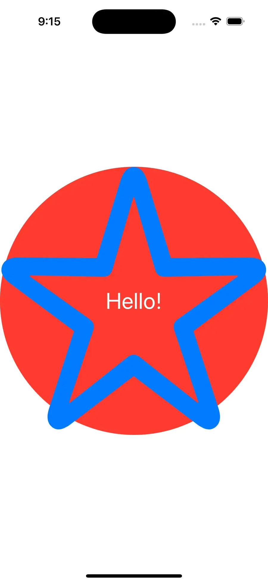
If we want to reproduce this in LVN we'd write it as:
def render(assigns, _interfaces) do
  ~LVN"""
  <Circle style="foregroundStyle(.red); overlay(content: :star)">
    <Image systemName="star" template={:star} style="resizable(); foregroundStyle(.blue); overlay(content: :text)">
      <Text template="text" style="font(.largeTitle); foregroundStyle(.white)">Hello!</Text>
    </Image>
  </Circle>
  """
end
Here is both the SwiftUI version and the LVN version rendered. Can you tell which is which?
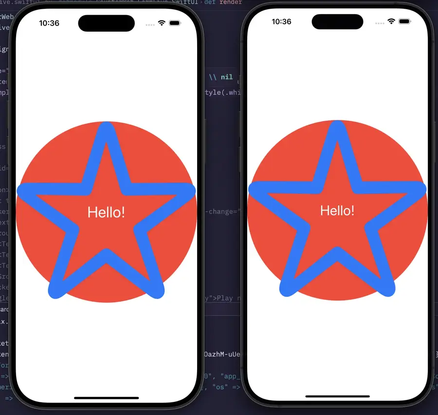
The overlay modifier allows you to overlay a SwiftUI view on top of the view it is modifying. In the above example we overlay twice. In LVN, to represent that nesting we use content: :star as the arguments to the overlay modifier. There are many modifiers that take named argument closures in SwiftUI that can render views. In LiveView Native we instead provide an atom for a reference to the corresponding template name. To use a template in this way it must meet two requirements:
- The element you wish you use as a template must be an immediate child of the element you are using the reference on
- The element must have a
template=attribute with the corresponding name. Note that either a string or an evaluated atom can be the value. The evaluated atom will compile to a string in the template.
Any elements that have template= values that are unused will be removed from the viewtree during the render cycle.
The only requirement for setting a template reference within a modifier:
- The reference value must be an atom, strings will error. (i.e.
overlay(content: :star)
Going back to the prior form example, we have template={:header} and other various template names being used, but where are the references from? Let's look at the constructor definition of Section in SwiftUI:
init(
    @ViewBuilder content: () -> Content,
    @ViewBuilder header: () -> Parent,
    @ViewBuilder footer: () -> Footer
)
Each of those named arguments are tagged as @ViewBuilder, this means they can take a view for each callback. In LiveView Native's own implementation of Section we have various examples of using the template references:
<Section>
  <Text template={:header}>Group #1</Text>
  <Text template={:content}>Item #1</Text>
  <Text template={:footer}>The first group ends here</Text>
</Section>
<Section>
  <Text template={:header}>Group #2</Text>
  <Text template={:content}>Item #1</Text>
  <Text template={:footer}>The second group ends here</Text>
</Section>
Next we have the Picker who's children are declaring as template=. Let's look at its constructor for SwiftUI:
init(
    selection: Binding<SelectionValue>,
    @ViewBuilder content: () -> Content,
    @ViewBuilder label: () -> Label
)
Again, we see @ViewBuilder tags for content and label which means these take views as arguments or within the callbacks. Knowing this we can assume that LiveView Native implements its convention:
<Picker selection={@transport} phx-change="transport-changed">
  <Text template={:label}>Transportation</Text>
  <Group template={:content}>
    <Label systemImage="car" tag="car">Car</Label>
    <Label systemImage="bus" tag="bus">Bus</Label>
    <Label systemImage="tram" tag="tram">Tram</Label>
  </Group>
</Picker>
The Template references end up being a very powerful abstraction that allows us to tap into the nesting ability of modifiers and view arguments within SwiftUI without having to break our desire to write markup. This approach keeps the markup reasonably flat and manageable. You'll be using template references a lot in LiveView Native and it's critical that you learn this concept.
Let's move on to refactoring our form example from before with function components.
If you recall here is where our form is currently with just markup:
def render(assigns, _interface) do
  ~LVN"""
  <LiveForm id="1" phx-submit="save">
    <Form>
      <Section>
        <Text template={:header}>Notifications</Text>
        <Picker name="settings[notify_type]" selection={@settings.notify_type} phx-change="notify">
          <Text template={:label}>Notify Me About</Text>
          <Group template={:content}>
            <Text tag="direct">Direct Messages</Text>
            <Text tag="mentions">Mentions</Text>
            <Text tag="anything">Anything</Text>
          </Group>
        </Picker>
        <Toggle isOn={@settings.play} phx-change="toggle-play" name="settings[play]">Play notification sounds</Toggle>
        <Toggle idOn={@settings.read_receipts} phx-change="toggle-read_receipts" name="settings[read_receipts]">Send read receipts</Toggle>
      </Section>
      <Section>
        <Text template={:header}>User Profiles</Text>
        <Picker name="settings[image_size]" selection={@settings.image_size} phx-change="image-size">
          <Text template={:label}>Profile Image Size</Text>
          <Group template={:content}>
            <Text tag="large">Large</Text>
            <Text tag="medium">Medium</Text>
            <Text tag="small">Small</Text>
          </Group>
        </Picker>
        <Button>Clear Image Cache</Button>
      </Section>
    </Form>
  </LiveForm>
  """
end
Refactoring this with the available CoreComponents:
def render(assigns, _interfaces) do
  ~LVN"""
  <.form for={@form} id="1" phx-submit="save">
    <Form>
      <Section>
        <Text template={:header}>Notifications</Text>
        <.input type="Picker" field={@form["notify_type"]} label="Notify Me About" options={[
          "Direct Messages": "direct",
          "Mentions": "mentions",
          "Anything": "anything"
        ]} phx-change="notify" />
        <.input type="Toggle" field={@form["play"]} label="Play notification sounds" phx-change="toggle_play" />
        <.input type="Toggle" field={@form["read_receipts"]} label="Send read receipts" phx-change="toggle_read_receipts" />
      </Section>
      <Section>
        <Text template={:header}>User Profiles</Text>
        <.input type="Picker" field={@form["image_size"]} label="Profile Image Size" options={[
          "Large": "large",
          "Medium": "medium",
          "Small": "small"
        ]} phx-change="image-size" />
        <.button>Clear image cache</.button>
      </Section>
    </Form>
  </.form>
  """
end
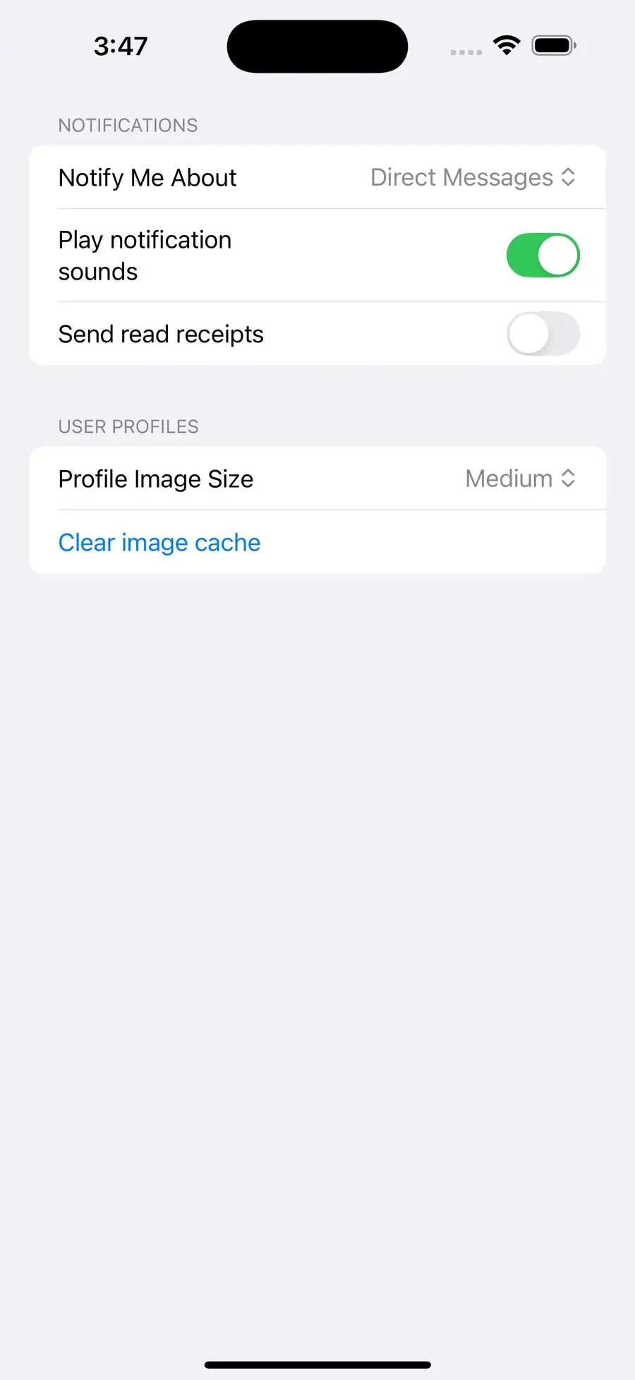
This is already much nicer than the pure markup version. You'll notice that input/1 is used a few times, with HTML you may set type="select" or type="checkbox". However, those are HTML types, with LiveView Native you must use the actual client's input type. That means type="Picker" and type="Toggle". The rest of the arguments and the value types they take is for the most part identical to what you are already doing in HTML. You'll notice that the label for "Play notification sounds" is forced to wrap and doesn't take the entire line. This is due to how that component is implemented, labels are wrapped in <LabeledContent> which will render differently.
Let's continue to refactor, in HTML you may prefer to use simple_form/1, as expected we have the same function component in LiveView Native:
def render(assigns, _interfaces) do
  ~LVN"""
  <.simple_form for={@form} id="1" phx-submit="save">
    <Section>
      <Text template={:header}>Notifications</Text>
      <.input type="Picker" field={@form["notify_type"]} label="Notify Me About" options={[
        "Direct Messages": "direct",
        "Mentions": "mentions",
        "Anything": "anything"
      ]} phx-change="notify" />
      <.input type="Toggle" field={@form["play"]} label="Play notification sounds" phx-change="toggle_play" />
      <.input type="Toggle" field={@form["read_receipts"]} label="Send read receipts" phx-change="toggle_read_receipts" />
    </Section>
    <Section>
      <Text template={:header}>User Profiles</Text>
      <.input type="Picker" field={@form["image_size"]} label="Profile Image Size" options={[
        "Large": "large",
        "Medium": "medium",
        "Small": "small"
      ]} phx-change="image-size" />
      <.button>Clear image cache</.button>
    </Section>
  </.simple_form>
  """
end
This saves us from having to wrap the form content in <Form>. In the future we'll likely add :section slots, it would be nice to write:
<:section header="User Profiles">
  <.input type="Picker" field={@form["image_size"]} label="Profile Image Size" options={[
    "Large": "large",
    "Medium": "medium",
    "Small": "small"
  ]} phx-change="image-size" />
  <.button>Clear image cache</.button>
</:section>
If you're feeling ambitious, we'd be happy to accept this as a PR.
Wrapping up
We've come a long way in this part. Let's bring this back to our counter app. Let's add a Slider to control the count's value. Using the buttons will also change the Stepper's value.
First let's change the root path of our app back to HomeLive:
   scope "/", CounterWeb do
     pipe_through :browser

---  live "/", FormLive
+++  live "/", HomeLive
   end
Next open lib/counter_web/live/swiftui/home_live.swiftui.neex template and replace with the following:
<ZStack>
  <Rectangle class="background-black"/>
  <VStack spacing="16">
    <Text class="counter"><%= @counter %></Text>
    <HStack spacing="8">
      <.counter_button class="button-red" value={-10} />
      <.counter_button class="button-orange" value={-1} />
      <.counter_button class="button-green" value={1} />
      <.counter_button class="button-blue" value={10} />
    </HStack>
    <.form id="1">
      <Slider lowerBound={-100} upperBound={100} step={1} name="count" value={@counter} phx-change="count-change" />
    </.form>
  </VStack>
</ZStack>
Add the following event handler to lib/counter_web/live/home_live.ex
def handle_event("count-change", %{"count" => value}, socket) do
  {value, _} = Integer.parse(value)
  {:noreply, assign(socket, :counter, value)}
end
Now you've got a nice slider that can also change the value!
If you made it this far you've learned quite a bit. Please share your experiences building with LiveView Native by at-mentioning @liveviewnative on Twitter.
In the next part we're going explore navigation patterns.


